

Open prompts
sample 03 AI Image Prompt
sample 03, its complete AI image prompt, and the Portraits, Weddings & Photography · Pixel Art · Dark Tones · 096 style are free to view and copy.
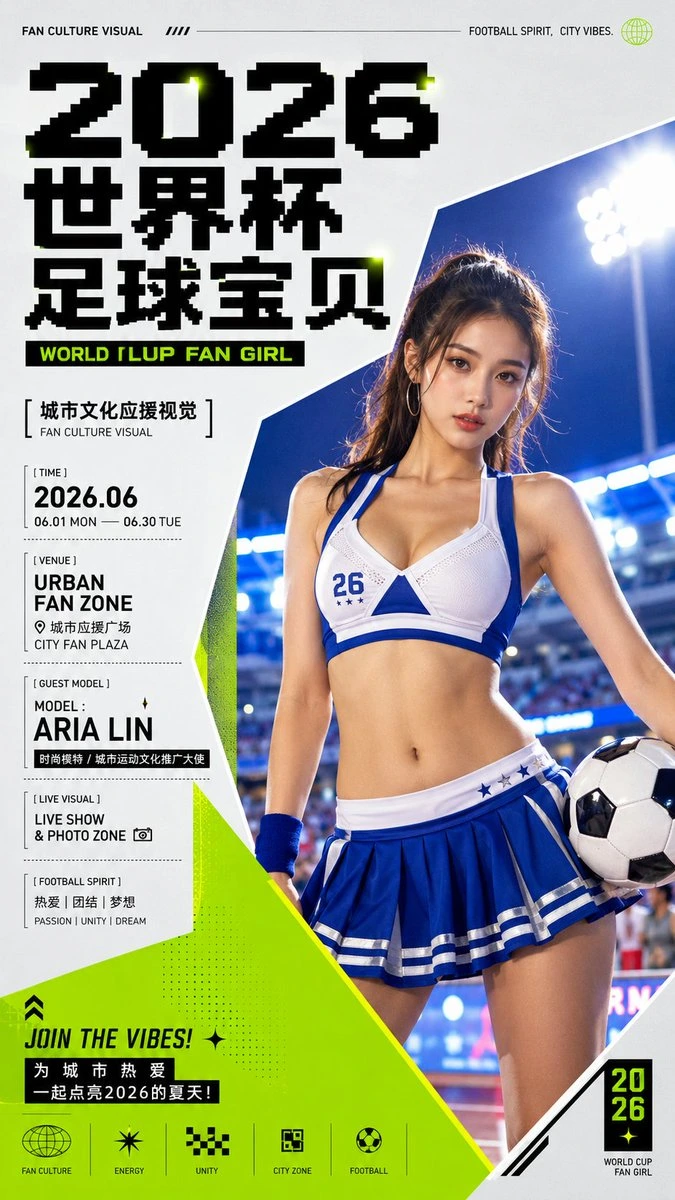
Complete AI image prompt
Build the first read around a collision between monumental identity lettering and a closely cropped thematic subject. Treat the words as a second dominant silhouette rather than a caption: use two or three abrupt scale jumps, compact the main name or message into a heavy contour, and let it press against, overlap, or lock into the subject edge. Bring the subject in from beyond the frame so its crop answers the typographic mass; maintain an approximately four-to-one jump between the dominant pair and all supporting information. Direct the eye from the heaviest wording to the face, defining form, or key detail, then back through small peripheral information. Govern the space with an asymmetric editorial grid: concentrate type and subject into a high-pressure weight while generous flat-field emptiness, a narrow annotation column, or a sharply cut color plane acts as the distant counterweight. Permit one controlled grid violation through a body or object crossing a column, lettering entering the image, or geometry interrupting an environmental window, always sustaining one continuous reading route. Derive the main carrier, symbolism, materials, and narrative cues from the subject’s own meaning, then distill that meaning into one tiny rounded mascot or line icon with an instantly legible expression; perch it on, tuck it behind, or let it peek over a high point in the subject silhouette, using it as the hinge between polished realism and approachable charm. Echo it sparingly with short dashes, dots, starbursts, a gestural underline, and a few theme-derived marks. Keep density responsive but bounded by message intensity. For intimate material, preserve a broad breathing field and combine one freely written emotional phrase, slender edge notes, and a high-contrast serif identity stack for a quiet keepsake quality. For energetic communication, tighten image and headline, switch the display voice to squared modular heavy glyphs or pixel-stepped letterforms, and arrange numbers, time, location, tags, and compact icons as disciplined information stacks with a forceful diagonal slice. In either state, one headline, one subject, and one miniature mascot must retain unmistakable rule. Preserve valid anatomy in the selected writing system: display glyphs use tight spacing, solid strokes, squared counters, and deliberate stepped edges; the handwritten voice uses natural joins, long directional sweeps, and isolated warm-color emphasis; supporting text stays very small, widely tracked, and confined to margins or narrow rails. Derive hues from the theme rather than fixed swatches. Place dark typography and a finely rendered realistic subject on a clean pale matte field, then choose one or two saturated theme colors as structural accents limited to cut planes, thin rules, keywords, clothing, or environmental echoes. Maintain clear value separation and restrained accent area. Render the subject with bright, soft commercial portrait or object lighting, natural skin or material response, crisp contours, and controlled highlights. Quiet content resolves into an even flat background; high-energy content opens a real environment through a hard-edged geometric window, with shallow depth and rim separation serving only the subject hierarchy. Finish with smooth uninterrupted fields, precise edges, and a consistent icon stroke so monumental type, intimate subject presence, playful attachment, and exact information order operate as one authored system.
Original style prompt
Build the first read around a collision between monumental identity lettering and a closely cropped thematic subject. Treat the words as a second dominant silhouette rather than a caption: use two or three abrupt scale jumps, compact the main name or message into a heavy contour, and let it press against, overlap, or lock into the subject edge. Bring the subject in from beyond the frame so its crop answers the typographic mass; maintain an approximately four-to-one jump between the dominant pair and all supporting information. Direct the eye from the heaviest wording to the face, defining form, or key detail, then back through small peripheral information. Govern the space with an asymmetric editorial grid: concentrate type and subject into a high-pressure weight while generous flat-field emptiness, a narrow annotation column, or a sharply cut color plane acts as the distant counterweight. Permit one controlled grid violation through a body or object crossing a column, lettering entering the image, or geometry interrupting an environmental window, always sustaining one continuous reading route. Derive the main carrier, symbolism, materials, and narrative cues from the subject’s own meaning, then distill that meaning into one tiny rounded mascot or line icon with an instantly legible expression; perch it on, tuck it behind, or let it peek over a high point in the subject silhouette, using it as the hinge between polished realism and approachable charm. Echo it sparingly with short dashes, dots, starbursts, a gestural underline, and a few theme-derived marks. Keep density responsive but bounded by message intensity. For intimate material, preserve a broad breathing field and combine one freely written emotional phrase, slender edge notes, and a high-contrast serif identity stack for a quiet keepsake quality. For energetic communication, tighten image and headline, switch the display voice to squared modular heavy glyphs or pixel-stepped letterforms, and arrange numbers, time, location, tags, and compact icons as disciplined information stacks with a forceful diagonal slice. In either state, one headline, one subject, and one miniature mascot must retain unmistakable rule. Preserve valid anatomy in the selected writing system: display glyphs use tight spacing, solid strokes, squared counters, and deliberate stepped edges; the handwritten voice uses natural joins, long directional sweeps, and isolated warm-color emphasis; supporting text stays very small, widely tracked, and confined to margins or narrow rails. Derive hues from the theme rather than fixed swatches. Place dark typography and a finely rendered realistic subject on a clean pale matte field, then choose one or two saturated theme colors as structural accents limited to cut planes, thin rules, keywords, clothing, or environmental echoes. Maintain clear value separation and restrained accent area. Render the subject with bright, soft commercial portrait or object lighting, natural skin or material response, crisp contours, and controlled highlights. Quiet content resolves into an even flat background; high-energy content opens a real environment through a hard-edged geometric window, with shallow depth and rim separation serving only the subject hierarchy. Finish with smooth uninterrupted fields, precise edges, and a consistent icon stroke so monumental type, intimate subject presence, playful attachment, and exact information order operate as one authored system.
More open images in the “Portraits, Weddings & Photography · Pixel Art · Dark Tones · 096” style