



Open prompts
sample 04 AI Image Prompt
sample 04, its complete AI image prompt, and the Brand Packaging & Commercial Design · Bright · 085 style are free to view and copy.
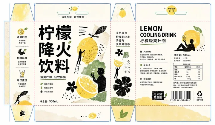
Complete AI image prompt
Build the first read around a monumental theme-led display title locked to one irregular paper-cut carrier of the subject’s most recognizable color, material cue, or symbolic image. Construct the lettering with heavy low-contrast geometric strokes, broad compressed glyphs, squared internal divisions, and selective component displacement while preserving valid anatomy and clear recognition in the chosen writing system. Give this anchor roughly half the visual weight; counter it with flat black action silhouettes and several torn collage fragments, while fine information retreats to the margins. Maintain asymmetric dynamic equilibrium and route the eye from the giant lettering through theme-meaningful gestures of holding, lifting, selecting, measuring, or examining, then across overlapping fragments into the informational layer. Crop hands or figures boldly at the boundary and reduce them to crisp black silhouettes that physically support, grasp, inspect, or make the paper forms, turning the subject into a tactile act of collection and discovery. Break theme-derived form, narrative, and symbolism into uneven organic polygons, specimen slips, stamped miniatures, sparse line drawings, and sharply varied scales; let selected pieces mask lettering, bridge columns, or continue across adjacent structural panels so overlap, continuity, and implied closure reunite the modular field. Preserve an expansive warm paper-white ground and generous active emptiness around a concentrated center. Limit color to paper white, deep ink black, one dominant family derived from the subject’s emotional and material associations, and one tiny contrasting accent; reserve color for the main carrier and a few rhythmic markers, using black to unify silhouette, title, and information structure. Establish an editorial hierarchy of dominant title, compact subhead, narrow body columns, numerals, fine rules, dots, and pictograms; set supporting copy in a neutral sans serif, alternating horizontal blocks with slender vertical runs, with dramatic scale drops and exact optical alignment. Information may divide with structural panels yet remain legible across their sequence. Render the system as hand-cut paper collage combined with flat offset or screen-printed ink: visible paper fibers along torn edges, one coherent relief print, botanical-like line imprint, or stamped texture inside each collage piece, and localized under-inking plus slight registration drift confined to silhouettes and large color shapes; keep the warm substrate, small type, and functional rules even, sharp, and intact. The result should unite approachable handmaking with disciplined editorial order as a collectible graphic and packaging language.
More open images in the “Brand Packaging & Commercial Design · Bright · 085” style