

Open prompts
sample 04 AI Image Prompt
sample 04, its complete AI image prompt, and the Infographics & Visual Guides · Paper Texture · Bright · 150 style are free to view and copy.
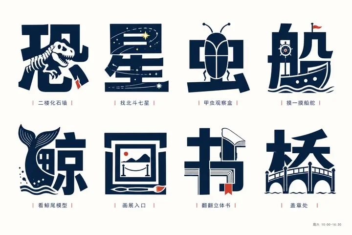
Complete AI image prompt
Build each dominant glyph as both legible writing and the structural body of a theme-driven illustration. Derive one defining action, object logic, construction, or emotional gesture from the subject, then let it replace, extend, pierce, enclose, or complete selected strokes, components, counters, and apertures: the character must read immediately at first glance, while the embedded narrative reveals itself on the second. Use heavy display lettering with broad faces, decisive turns, stable centers of gravity, and strong orthographic recognition; allow bounded variation between a squared geometric gothic skeleton and a more inscription-like skeleton with clipped corners and controlled width shifts, always preserving valid component topology and writing direction. Render the theme imagery through a hybrid of bold flat vector masses and precise monoline drawing. Large filled shapes carry typographic weight, while fine contours describe mechanisms, motion paths, and a tightly edited set of internal details. Let one thematic feature cross the glyph edge as a controlled grid break, while closure and figure-ground completion resolve the remaining contour inside the counterspace. Echo the curves, terminals, and repeated motifs of the illustration in neighboring strokes so image and letter share one silhouette instead of behaving as an icon placed over type. Organize the set as evenly scaled modules with a steady row-and-column rhythm, generous breathing intervals, consistent optical margins, and a clear baseline. Within every module, the glyph overwhelmingly dominates; a single escaping contour, directional line, or accent point creates slight off-center tension without disturbing the overall equilibrium. Place very small, widely tracked index information beneath each glyph—compact numbering, a short label, and restrained separators—creating an emphatic scale jump from semantic display form to quiet catalog metadata; use hairline dividers only where they clarify the modular system. Derive the palette from the subject but restrict its roles to a deep structural ink, warm paper white, and one or two vivid accents used only at narrative joints, locators, or information nodes. Either light or dark grounds may lead, provided the glyph-ground value contrast stays forceful and the accent area remains sparse. Finish with an even matte paper field, flat unbroken ink, crisp contours, and consistently weighted fine lines. Suggest space through simple two-dimensional layering, explicit occlusion, and a few linear cues rather than modeled illumination. Let the subject determine glyph semantics, embedded motifs, attached marks, color associations, and information hierarchy while preserving the defining system: type becomes image, image rewrites type, modular order frames one controlled interruption, and monumental lettering is counterpointed by minute editorial annotation.
Original style prompt
Build each dominant glyph as both legible writing and the structural body of a theme-driven illustration. Derive one defining action, object logic, construction, or emotional gesture from the subject, then let it replace, extend, pierce, enclose, or complete selected strokes, components, counters, and apertures: the character must read immediately at first glance, while the embedded narrative reveals itself on the second. Use heavy display lettering with broad faces, decisive turns, stable centers of gravity, and strong orthographic recognition; allow bounded variation between a squared geometric gothic skeleton and a more inscription-like skeleton with clipped corners and controlled width shifts, always preserving valid component topology and writing direction. Render the theme imagery through a hybrid of bold flat vector masses and precise monoline drawing. Large filled shapes carry typographic weight, while fine contours describe mechanisms, motion paths, and a tightly edited set of internal details. Let one thematic feature cross the glyph edge as a controlled grid break, while closure and figure-ground completion resolve the remaining contour inside the counterspace. Echo the curves, terminals, and repeated motifs of the illustration in neighboring strokes so image and letter share one silhouette instead of behaving as an icon placed over type. Organize the set as evenly scaled modules with a steady row-and-column rhythm, generous breathing intervals, consistent optical margins, and a clear baseline. Within every module, the glyph overwhelmingly dominates; a single escaping contour, directional line, or accent point creates slight off-center tension without disturbing the overall equilibrium. Place very small, widely tracked index information beneath each glyph—compact numbering, a short label, and restrained separators—creating an emphatic scale jump from semantic display form to quiet catalog metadata; use hairline dividers only where they clarify the modular system. Derive the palette from the subject but restrict its roles to a deep structural ink, warm paper white, and one or two vivid accents used only at narrative joints, locators, or information nodes. Either light or dark grounds may lead, provided the glyph-ground value contrast stays forceful and the accent area remains sparse. Finish with an even matte paper field, flat unbroken ink, crisp contours, and consistently weighted fine lines. Suggest space through simple two-dimensional layering, explicit occlusion, and a few linear cues rather than modeled illumination. Let the subject determine glyph semantics, embedded motifs, attached marks, color associations, and information hierarchy while preserving the defining system: type becomes image, image rewrites type, modular order frames one controlled interruption, and monumental lettering is counterpointed by minute editorial annotation.
More open images in the “Infographics & Visual Guides · Paper Texture · Bright · 150” style