

Open prompts
sample 05 AI Image Prompt
sample 05, its complete AI image prompt, and the Typography & Posters · Line Art · Bright · 254 style are free to view and copy.
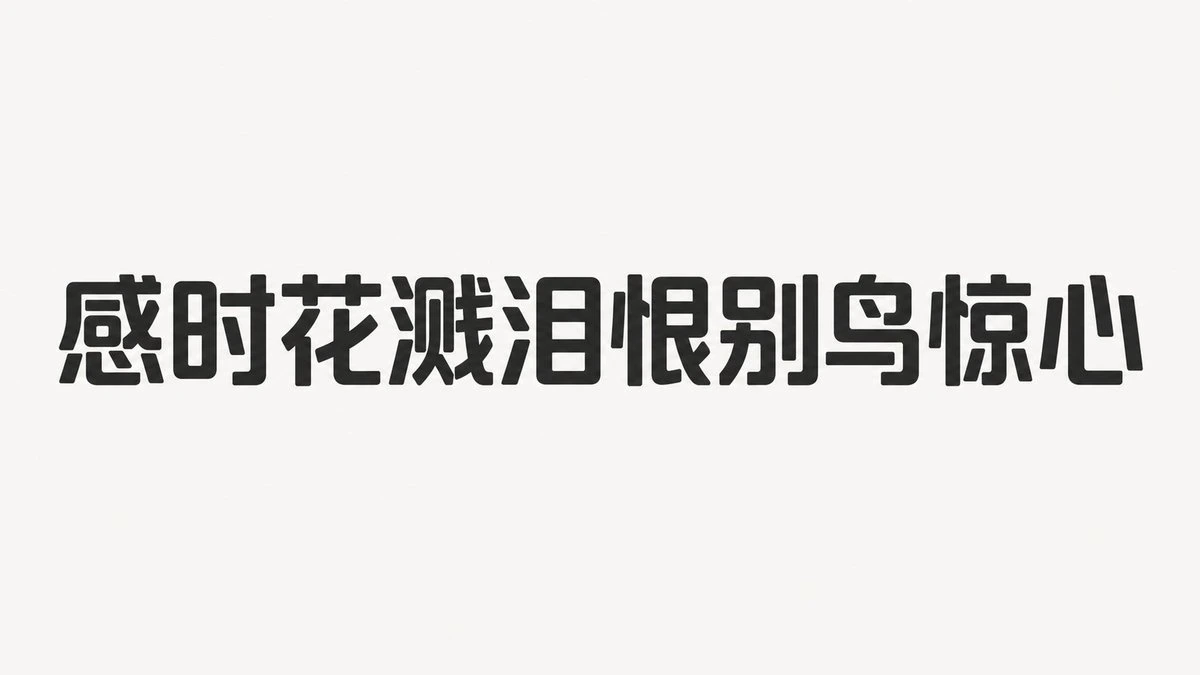
Complete AI image prompt
Make lettering the sole visual event, choosing one of two clearly bounded expressions of the same reduced glyph skeleton according to the subject’s emotional pressure, or assigning them to separate hierarchy levels. In the airy mode, draw orthographically valid characters, numerals, and punctuation with an exceptionally thin, nearly uniform black monoline; let one continuous path travel through neighboring glyphs and subject-derived symbols, extending selected bars and terminals into loops, open curves, tethers, shared strokes, and graceful cross-word connections. In the forceful mode, compress that skeleton into extremely heavy geometric black glyphs with solid stems, gently softened corners, open squared counters, and tight spacing, forming one dense declarative band. Keep wording and reading order immediately legible in either mode, with distortion governing the rhythm of the phrase rather than decorating isolated characters. Let the subject supply the actual message, symbolic contour, and narrative cue: the airy mode converts these into tiny line icons, partial enclosures, or terminal gestures that share the lettering path, while the forceful mode converts semantic intensity into controlled changes of width, weight, and black-to-white pressure. Suspend a single information center within a vast, even matte field of warm or slightly cool white; the occupied area stays restrained and the surrounding uninterrupted emptiness is substantially larger. Use axial stability with asymmetric dynamic balance: the eye enters at the strongest phrase, moves along a continuous stroke or compressed baseline, then resolves at one displaced mark, line figure, or punctuation point. Content length and placement may change, but preserve the dramatic hierarchy jump, quiet outer edges, and the tension between compact information and expansive blank space. In airy compositions, place only a few pinpoint circular accents at joins, pauses, and miniature symbols, deriving one restrained hue from the subject’s emotional temperature; keep them sparse rhythmic signals rather than colored masses. A secondary subject figure may be reduced to one continuous contour with only essential joints and action, remaining dramatically smaller than the main phrase. In forceful compositions, retain the uncompromised figure-ground impact of flat black lettering on white. Render everything as clean two-dimensional ink with continuous fills, crisp intact edges, and no modeled light, unifying lyrical linework and emphatic typographic mass through restraint, candor, and a slight hand-drawn warmth.
Original style prompt
Make lettering the sole visual event, choosing one of two clearly bounded expressions of the same reduced glyph skeleton according to the subject’s emotional pressure, or assigning them to separate hierarchy levels. In the airy mode, draw orthographically valid characters, numerals, and punctuation with an exceptionally thin, nearly uniform black monoline; let one continuous path travel through neighboring glyphs and subject-derived symbols, extending selected bars and terminals into loops, open curves, tethers, shared strokes, and graceful cross-word connections. In the forceful mode, compress that skeleton into extremely heavy geometric black glyphs with solid stems, gently softened corners, open squared counters, and tight spacing, forming one dense declarative band. Keep wording and reading order immediately legible in either mode, with distortion governing the rhythm of the phrase rather than decorating isolated characters. Let the subject supply the actual message, symbolic contour, and narrative cue: the airy mode converts these into tiny line icons, partial enclosures, or terminal gestures that share the lettering path, while the forceful mode converts semantic intensity into controlled changes of width, weight, and black-to-white pressure. Suspend a single information center within a vast, even matte field of warm or slightly cool white; the occupied area stays restrained and the surrounding uninterrupted emptiness is substantially larger. Use axial stability with asymmetric dynamic balance: the eye enters at the strongest phrase, moves along a continuous stroke or compressed baseline, then resolves at one displaced mark, line figure, or punctuation point. Content length and placement may change, but preserve the dramatic hierarchy jump, quiet outer edges, and the tension between compact information and expansive blank space. In airy compositions, place only a few pinpoint circular accents at joins, pauses, and miniature symbols, deriving one restrained hue from the subject’s emotional temperature; keep them sparse rhythmic signals rather than colored masses. A secondary subject figure may be reduced to one continuous contour with only essential joints and action, remaining dramatically smaller than the main phrase. In forceful compositions, retain the uncompromised figure-ground impact of flat black lettering on white. Render everything as clean two-dimensional ink with continuous fills, crisp intact edges, and no modeled light, unifying lyrical linework and emphatic typographic mass through restraint, candor, and a slight hand-drawn warmth.
More open images in the “Typography & Posters · Line Art · Bright · 254” style