

Open prompts
sample 05 AI Image Prompt
sample 05, its complete AI image prompt, and the Photo Restyling · Printmaking · Line Art · 216 style are free to view and copy.
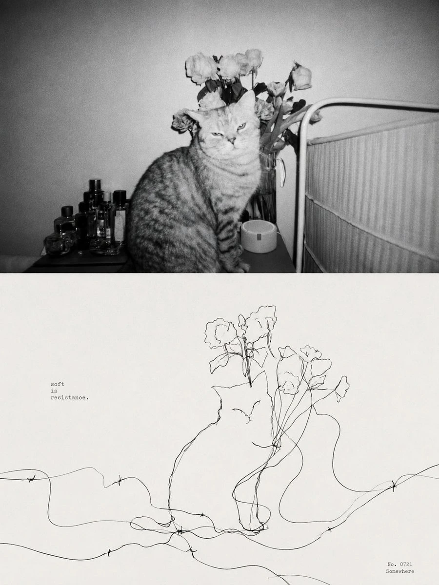
Complete AI image prompt
Build a joined two-tier narrative in which documentary reality becomes its drawn interpretation. The upper tier establishes the subject through a candid, era-aware photograph with believable environment, light, spatial depth, and a decisive human or material moment; the lower tier restages the same viewpoint, silhouette, gesture, perspective, and essential relationships on a generous warm unbleached-paper field. Make the visual correspondence immediate: the dense photographic evidence yields to open paper, matching subject scale and optical weight across a restrained straight boundary, while a key contour guides the eye downward from recognition to emotional, structural, or symbolic understanding. Let the subject’s structural complexity and emotional temperature select one bounded drawing grammar. Systematic content becomes precise monochrome drafting with even fine contours, preserved perspective, construction, and environmental depth. Gesture-led content becomes economical black continuous-line drawing, with exact detail only at recognition points and one or several long threads looping, crossing, tangling, and running off the edges to connect figures, charge empty space, and carry a second narrative. Intimate or emblematic content becomes a low-chroma limited-ink illustration of rounded simplified masses, dark enclosing outlines, and an arch-like figure-ground frame that poetically recasts the photographed setting. Across all three modes, reduce the photograph to its most recognizable silhouette, spatial skeleton, contact relationships, directional props, and light markers; introduce subject-derived symbols only in negative space or at the periphery while preserving the scene’s causal logic. Draw photographic color from the actual subject and setting, keeping credible illumination, gentle highlight rolloff, and restrained overall chroma. Answer it below with black line on paper or two to four matte inks extracted from the photographic palette; let paper occupy most of the breathing field and reserve a small warm or high-chroma accent for the emotional focus. Fine lines carry slight pressure variation, open contours, and occasional retraced junctions. In the limited-ink mode, pigment presses unevenly into the paper fibers only within the illustrated ink shapes, while faces, essential symbols, and open paper remain legible and intact. Use lettering only as a quiet information coordinate: either a large widely tracked heading or tiny typewriter-like notes, supported by short rules, numbering, place data, or dates. Preserve valid glyph anatomy for the chosen writing system and keep the information clear of the photographic subject. The result should feel like a disciplined editorial archive warmed by hand translation, with correspondence between reality and drawing as the primary event and every decorative decision subordinate to that bond.


——————
Create an ultra-high-resolution, print-ready 3:4 portrait poster from the final theme. Use a diptych split into two strictly equal horizontal halves, each exactly 50% of the height. Upper half: build one complete, coherent, realistic, lived-in scene from the theme. For a city, distill its character from spatial landscape, street life, local culture, commerce, food memories, historical layers, and daily rhythm, then integrate those cues into one authentic urban cross-section rather than a collage. For a named street, neighborhood, landmark, shopping district, shop, building, or representative place, prioritize true spatial relationships and accurately show street structure, façades, storefront signs, transport infrastructure, writing systems, crowd behavior, and atmosphere, preserving distinctive local traits. If an address, coordinates, or reference image is supplied, ground the scene in that real information; do not invent or substitute generic scenery. Avoid cheap tourism advertising and postcard clichés. Capture a refined, restrained, believable everyday moment in which people, buildings, streets, signs, windows, facilities, and activities coexist naturally and landmarks remain integrated rather than exaggerated. Lower half: extract the upper scene’s most recognizable subject, silhouette, structure, pose, and narrative relationships into a minimalist line-based graphic. Replace literal detail with thin precise monoline drawing, clear geometric perspective, controlled negative space, ordered detail rhythm, and moderately abstract simplified forms while retaining immediate recognition. For a city or place, distill the essential skyline, street frontage, sign rhythm, transport elements, shop-window relationships, or crowd state. For any other theme, distill its defining identity, contour language, structural relationships, and visual memory points into a unified, concise, modern, premium line-poster language. Add only a few geometric guides, horizontal rules, vertical construction lines, or rhythmic voids so the lower half reads as a designed abstraction of the reality above. Integrate typography into the layout. Place a prominent main title at the top. Supporting copy may use the original theme wording, local language, country or region, address, coordinates, number, year, or one brief description. Any street text, signage, or place information must be clear, natural, accurate, and professionally spelled—no gibberish or errors. Typography should be simple and ordered, contributing to the finish of a collectible travel poster or city identity system. Derive a theme-specific palette from climate, light, time, building materials, historical atmosphere, commercial warmth, food associations, natural setting, and emotional texture. Use monochrome-print aesthetics or very few restrained colors, creating richness through line density, value steps, selective weight, negative-space ratios, and detail rhythm. Final quality: crisp lines, rich detail, unified style, quiet modernity, lively restraint, and sophisticated finish.
Original style prompt
Build a joined two-tier narrative in which documentary reality becomes its drawn interpretation. The upper tier establishes the subject through a candid, era-aware photograph with believable environment, light, spatial depth, and a decisive human or material moment; the lower tier restages the same viewpoint, silhouette, gesture, perspective, and essential relationships on a generous warm unbleached-paper field. Make the visual correspondence immediate: the dense photographic evidence yields to open paper, matching subject scale and optical weight across a restrained straight boundary, while a key contour guides the eye downward from recognition to emotional, structural, or symbolic understanding. Let the subject’s structural complexity and emotional temperature select one bounded drawing grammar. Systematic content becomes precise monochrome drafting with even fine contours, preserved perspective, construction, and environmental depth. Gesture-led content becomes economical black continuous-line drawing, with exact detail only at recognition points and one or several long threads looping, crossing, tangling, and running off the edges to connect figures, charge empty space, and carry a second narrative. Intimate or emblematic content becomes a low-chroma limited-ink illustration of rounded simplified masses, dark enclosing outlines, and an arch-like figure-ground frame that poetically recasts the photographed setting. Across all three modes, reduce the photograph to its most recognizable silhouette, spatial skeleton, contact relationships, directional props, and light markers; introduce subject-derived symbols only in negative space or at the periphery while preserving the scene’s causal logic. Draw photographic color from the actual subject and setting, keeping credible illumination, gentle highlight rolloff, and restrained overall chroma. Answer it below with black line on paper or two to four matte inks extracted from the photographic palette; let paper occupy most of the breathing field and reserve a small warm or high-chroma accent for the emotional focus. Fine lines carry slight pressure variation, open contours, and occasional retraced junctions. In the limited-ink mode, pigment presses unevenly into the paper fibers only within the illustrated ink shapes, while faces, essential symbols, and open paper remain legible and intact. Use lettering only as a quiet information coordinate: either a large widely tracked heading or tiny typewriter-like notes, supported by short rules, numbering, place data, or dates. Preserve valid glyph anatomy for the chosen writing system and keep the information clear of the photographic subject. The result should feel like a disciplined editorial archive warmed by hand translation, with correspondence between reality and drawing as the primary event and every decorative decision subordinate to that bond.
More open images in the “Photo Restyling · Printmaking · Line Art · 216” style