

Open prompts
sample 05 AI Image Prompt
sample 05, its complete AI image prompt, and the Presentations & Courseware · Paper Texture · Bright · 289 style are free to view and copy.
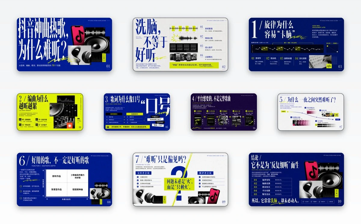
Complete AI image prompt
Build the first read around an enormous, condensed display headline with extreme stroke contrast: valid glyphs use long verticals, narrow counters, blade-like terminals, and occasional horizontal thrusts, compressing the subject's central proposition into two to four forceful lines. Give this type block most of the visual weight on one side and counterbalance it asymmetrically with theme-derived evidence imagery, diagrams, and explanatory modules. Govern the information with a disciplined modular grid and a stepped reading route: headline first, then fluorescent annotations and numbering, a cluster of overlapping hard-cropped monochrome images, concise explanatory copy, data graphics, and a highlighted conclusion. Keep the grid exact while allowing one controlled breach—letterforms crossing a rule, images masking one another, or a hand-drawn stroke cutting through modules—to energize the system. Let the subject supply the question, symbols, evidence, relationships, and hierarchy; turn its factual or conceptual material into waveform-like traces, line plots, nodes, matrices, scales, or an equivalent native data grammar. Treat photographs as high-contrast black-and-white editorial evidence, enlarging selected details until nearly abstract and preserving crisp rectangular edges. Rotate three structural color roles across the series: deep cobalt blue, bright paper white, and electric acid yellow-green may become the dominant field, headline ink, or annotation color, enabling forceful blue-and-white and fluorescent-and-black reversals; black anchors imagery and diagrams, while a subject-derived hue appears at only one focal point. Bind the fluorescent accent to keywords, repeated intervals, leader lines, scribbled underlines, micro-labels, and conclusion bars so it reads as an editor's active judgment rather than ambient decoration. Create steep scale jumps from monumental headline to medium indices, compact body copy, tiny running heads, and edge page numbers. Use tall high-contrast serif numerals, clear condensed sans-serif text, and narrowly set uppercase auxiliary copy with open tracking. Finish with hairline dividers, registration crosses, dot matrices, short ticks, quotation marks, reduced icons, and marginal folios. Maintain even flat color fields, sharp unbroken rules, clean ink shapes, hard image boundaries, and a precise editorial surface, balancing experimental tension with dense legibility.
Original style prompt
Build the first read around an enormous, condensed display headline with extreme stroke contrast: valid glyphs use long verticals, narrow counters, blade-like terminals, and occasional horizontal thrusts, compressing the subject's central proposition into two to four forceful lines. Give this type block most of the visual weight on one side and counterbalance it asymmetrically with theme-derived evidence imagery, diagrams, and explanatory modules. Govern the information with a disciplined modular grid and a stepped reading route: headline first, then fluorescent annotations and numbering, a cluster of overlapping hard-cropped monochrome images, concise explanatory copy, data graphics, and a highlighted conclusion. Keep the grid exact while allowing one controlled breach—letterforms crossing a rule, images masking one another, or a hand-drawn stroke cutting through modules—to energize the system. Let the subject supply the question, symbols, evidence, relationships, and hierarchy; turn its factual or conceptual material into waveform-like traces, line plots, nodes, matrices, scales, or an equivalent native data grammar. Treat photographs as high-contrast black-and-white editorial evidence, enlarging selected details until nearly abstract and preserving crisp rectangular edges. Rotate three structural color roles across the series: deep cobalt blue, bright paper white, and electric acid yellow-green may become the dominant field, headline ink, or annotation color, enabling forceful blue-and-white and fluorescent-and-black reversals; black anchors imagery and diagrams, while a subject-derived hue appears at only one focal point. Bind the fluorescent accent to keywords, repeated intervals, leader lines, scribbled underlines, micro-labels, and conclusion bars so it reads as an editor's active judgment rather than ambient decoration. Create steep scale jumps from monumental headline to medium indices, compact body copy, tiny running heads, and edge page numbers. Use tall high-contrast serif numerals, clear condensed sans-serif text, and narrowly set uppercase auxiliary copy with open tracking. Finish with hairline dividers, registration crosses, dot matrices, short ticks, quotation marks, reduced icons, and marginal folios. Maintain even flat color fields, sharp unbroken rules, clean ink shapes, hard image boundaries, and a precise editorial surface, balancing experimental tension with dense legibility.
More open images in the “Presentations & Courseware · Paper Texture · Bright · 289” style