

Open prompts
sample 05 AI Image Prompt
sample 05, its complete AI image prompt, and the Traditional Culture · Paper Texture · Bright · 046 style are free to view and copy.
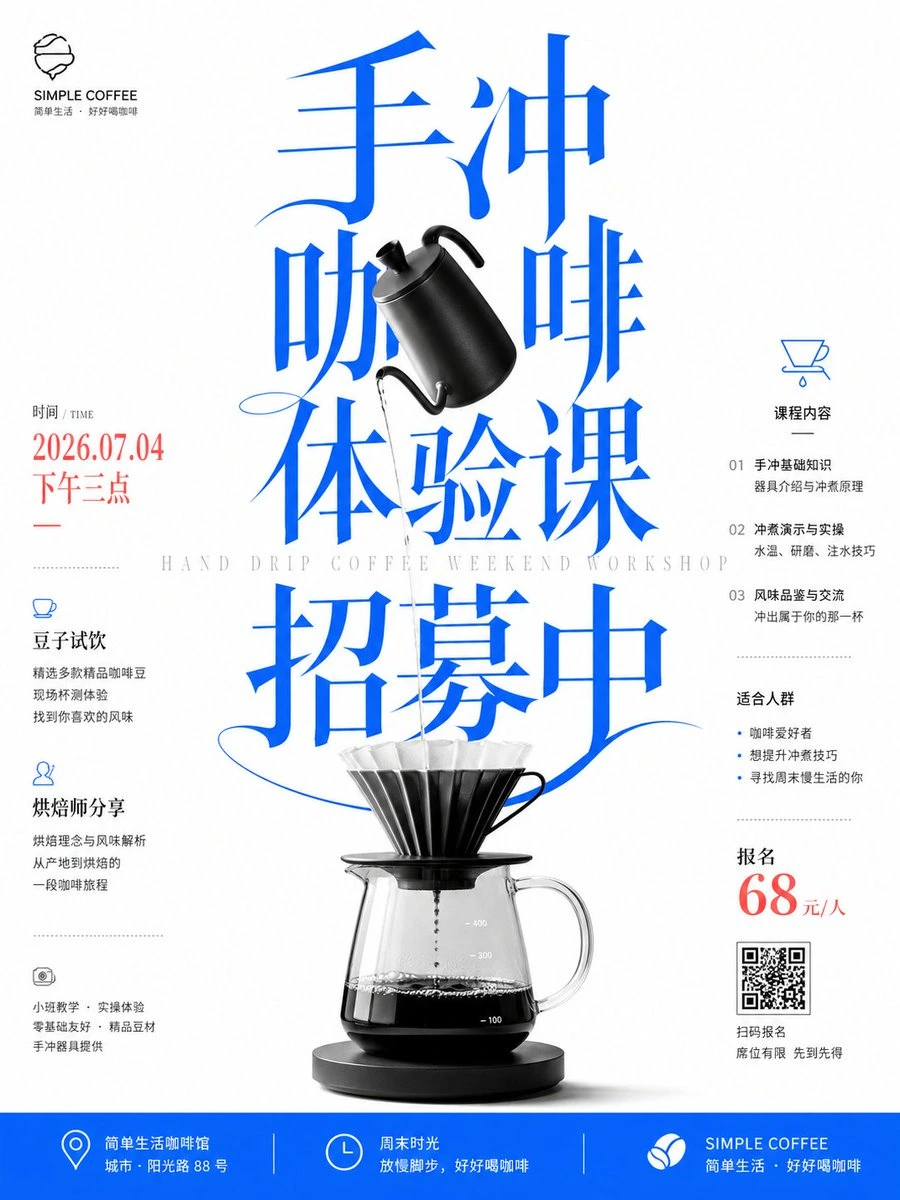
Complete AI image prompt
Turn the theme name into the dominant pictorial mass: build a compact cluster of a few monumental custom glyphs that remains orthographically valid in the required writing system while carrying direction, weight, and emotion as an image. Choose a bounded lettering mode from the subject's tone. For an intimate or forceful subject, use authentic loaded-brush logic—pressure-swollen black masses, decisive pauses and turns, split bristle traces, paper showing through inside fast strokes, and long tapering exits. For a rational subject, start from a high-contrast display skeleton with compressed proportions, emphatic verticals, hairline horizontals, sharp wedge terminals, and equally exaggerated sweeps. In either mode, bind neighboring glyphs through shared strokes, overlaps, and continuous arcs; let selected terminals escape the cluster so dense cores release into fine distant points. Set this dominant mass against an even luminous white or warm-white paper field with generous intervals that act as deliberate pauses. The eye should strike the large lettering first, travel through diagonal sweeps and upright stems, then settle on sparse supporting information; preserve a dramatic scale jump and asymmetric dynamic equilibrium rather than distributing elements evenly. When the theme provides a recognizable object, use it as the sole high-resolution physical anchor, retaining its plausible volume, reflectance, and material, and thread it through the lettering in a frontal or near-frontal view: some strokes occlude it, others pass behind it, with silhouettes interlocking through the counters and contact shadows used only to clarify depth. For an abstract theme, let its primary symbolic form perform the same interlocking role. Keep the palette severely limited: white owns most of the field; the dominant glyphs take either deep ink black or one saturated cool hue derived from the subject; the physical anchor stays in controlled black-and-white values; one small warm accent may carry a date, price, or action cue. A pure lettering treatment may let black ink carry the entire hierarchy. If the message requires dense information, organize narrow supporting text, fine-line icons, and short rules into light peripheral columns, using condensed forms, open tracking, a clear baseline rhythm, and a three-step hierarchy of heading, key numeral, and explanation. If information is sparse, withdraw those modules and let emptiness become the counterweight. Preserve a flat bright ground with a faint natural paper fiber, confine ink-load variation to the brush strokes, keep constructed type edges crisp, and light the physical anchor softly and selectively so calligraphic velocity, modern information order, and the scale tension of image against type read as one authored system.
Original style prompt
Turn the theme name into the dominant pictorial mass: build a compact cluster of a few monumental custom glyphs that remains orthographically valid in the required writing system while carrying direction, weight, and emotion as an image. Choose a bounded lettering mode from the subject's tone. For an intimate or forceful subject, use authentic loaded-brush logic—pressure-swollen black masses, decisive pauses and turns, split bristle traces, paper showing through inside fast strokes, and long tapering exits. For a rational subject, start from a high-contrast display skeleton with compressed proportions, emphatic verticals, hairline horizontals, sharp wedge terminals, and equally exaggerated sweeps. In either mode, bind neighboring glyphs through shared strokes, overlaps, and continuous arcs; let selected terminals escape the cluster so dense cores release into fine distant points. Set this dominant mass against an even luminous white or warm-white paper field with generous intervals that act as deliberate pauses. The eye should strike the large lettering first, travel through diagonal sweeps and upright stems, then settle on sparse supporting information; preserve a dramatic scale jump and asymmetric dynamic equilibrium rather than distributing elements evenly. When the theme provides a recognizable object, use it as the sole high-resolution physical anchor, retaining its plausible volume, reflectance, and material, and thread it through the lettering in a frontal or near-frontal view: some strokes occlude it, others pass behind it, with silhouettes interlocking through the counters and contact shadows used only to clarify depth. For an abstract theme, let its primary symbolic form perform the same interlocking role. Keep the palette severely limited: white owns most of the field; the dominant glyphs take either deep ink black or one saturated cool hue derived from the subject; the physical anchor stays in controlled black-and-white values; one small warm accent may carry a date, price, or action cue. A pure lettering treatment may let black ink carry the entire hierarchy. If the message requires dense information, organize narrow supporting text, fine-line icons, and short rules into light peripheral columns, using condensed forms, open tracking, a clear baseline rhythm, and a three-step hierarchy of heading, key numeral, and explanation. If information is sparse, withdraw those modules and let emptiness become the counterweight. Preserve a flat bright ground with a faint natural paper fiber, confine ink-load variation to the brush strokes, keep constructed type edges crisp, and light the physical anchor softly and selectively so calligraphic velocity, modern information order, and the scale tension of image against type read as one authored system.
More open images in the “Traditional Culture · Paper Texture · Bright · 046” style