

Open prompts
sample 06 AI Image Prompt
sample 06, its complete AI image prompt, and the Travel, Cities & Architecture · Vector · 067 style are free to view and copy.
Complete AI image prompt
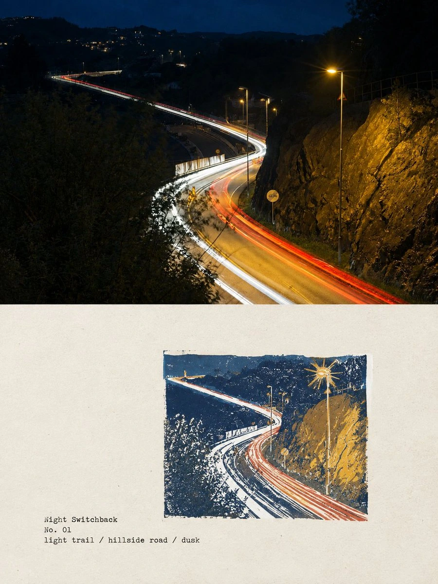
Establish the subject first as clear, credible observed reality with situational light and spatial depth, then recode that same subject in an adjoining field of warm uncoated paper as a limited-ink relief print, creating an immediate passage from witnessed evidence to a deliberately catalogued artifact. Join the two registers with a clean horizontal boundary: the observed scene carries the dominant mass and context while the printed register retains expansive breathing room. Preserve exact correspondences in silhouette, pose, directional force, and the subject’s highest-recognition detail, then reorganize them below through a decisive crop, scale jump, or isolated enlargement rather than literal duplication. Reduce continuous tone to two to four solid inks, carved marks, hatching, and controlled dot fields; use the darkest ink for structure, a middle ink for volume, and one saturated hue derived from the subject or setting only at crucial recognition points, allowing broad paper white to complete contours and tonal intervals. Let hue families change with the subject’s emotional temperature, material associations, and symbolism while keeping the value hierarchy crisp and total chroma restrained. Build edges from hand-cut short strokes, directional hatching, blade turns, and localized broken ink; within the printed image alone, relief pressure and paper fibers let the substrate show through the ink, while the surrounding paper remains even, quiet, and continuous. Derive titles, numbers, locations, or terse attributes from the subject’s own information system. For an emphatic treatment, set an extremely heavy condensed sans-serif block with tight rhythm, image overlap, and a confrontational scale jump; for a restrained treatment, reduce it to small monospaced typewriter-like notes, fine rules, open leading, and offset whitespace as an archival label. Choose one intensity and preserve a steep hierarchy. Keep the chosen writing system orthographically correct, shaping strokes, counters, joins, and spacing to share the firm, lightly impressed rhythm of the carved image. Govern the composition through roughly two-to-one perceptual weight between observed reality and printed interpretation, asymmetrical dynamic equilibrium, and a continuous eye path: convert roads, gazes, ridgelines, gestures, or object axes from the scene into the direction of carved marks, use edge crops as entry pressure, and let small text act as a distant counterweight. The subject may replace forms, setting, symbols, color sources, and narrative cues, but the verifiable visual evidence linking reality to print, the limited-ink separation logic, the paper-and-ink tactility, and the editorial archival hierarchy must remain unmistakable.
Original style prompt
Establish the subject first as clear, credible observed reality with situational light and spatial depth, then recode that same subject in an adjoining field of warm uncoated paper as a limited-ink relief print, creating an immediate passage from witnessed evidence to a deliberately catalogued artifact. Join the two registers with a clean horizontal boundary: the observed scene carries the dominant mass and context while the printed register retains expansive breathing room. Preserve exact correspondences in silhouette, pose, directional force, and the subject’s highest-recognition detail, then reorganize them below through a decisive crop, scale jump, or isolated enlargement rather than literal duplication. Reduce continuous tone to two to four solid inks, carved marks, hatching, and controlled dot fields; use the darkest ink for structure, a middle ink for volume, and one saturated hue derived from the subject or setting only at crucial recognition points, allowing broad paper white to complete contours and tonal intervals. Let hue families change with the subject’s emotional temperature, material associations, and symbolism while keeping the value hierarchy crisp and total chroma restrained. Build edges from hand-cut short strokes, directional hatching, blade turns, and localized broken ink; within the printed image alone, relief pressure and paper fibers let the substrate show through the ink, while the surrounding paper remains even, quiet, and continuous. Derive titles, numbers, locations, or terse attributes from the subject’s own information system. For an emphatic treatment, set an extremely heavy condensed sans-serif block with tight rhythm, image overlap, and a confrontational scale jump; for a restrained treatment, reduce it to small monospaced typewriter-like notes, fine rules, open leading, and offset whitespace as an archival label. Choose one intensity and preserve a steep hierarchy. Keep the chosen writing system orthographically correct, shaping strokes, counters, joins, and spacing to share the firm, lightly impressed rhythm of the carved image. Govern the composition through roughly two-to-one perceptual weight between observed reality and printed interpretation, asymmetrical dynamic equilibrium, and a continuous eye path: convert roads, gazes, ridgelines, gestures, or object axes from the scene into the direction of carved marks, use edge crops as entry pressure, and let small text act as a distant counterweight. The subject may replace forms, setting, symbols, color sources, and narrative cues, but the verifiable visual evidence linking reality to print, the limited-ink separation logic, the paper-and-ink tactility, and the editorial archival hierarchy must remain unmistakable.
More open images in the “Travel, Cities & Architecture · Vector · 067” style