

Open prompts
sample 07 AI Image Prompt
sample 07, its complete AI image prompt, and the Typography & Posters · X Archive · 259 style are free to view and copy.
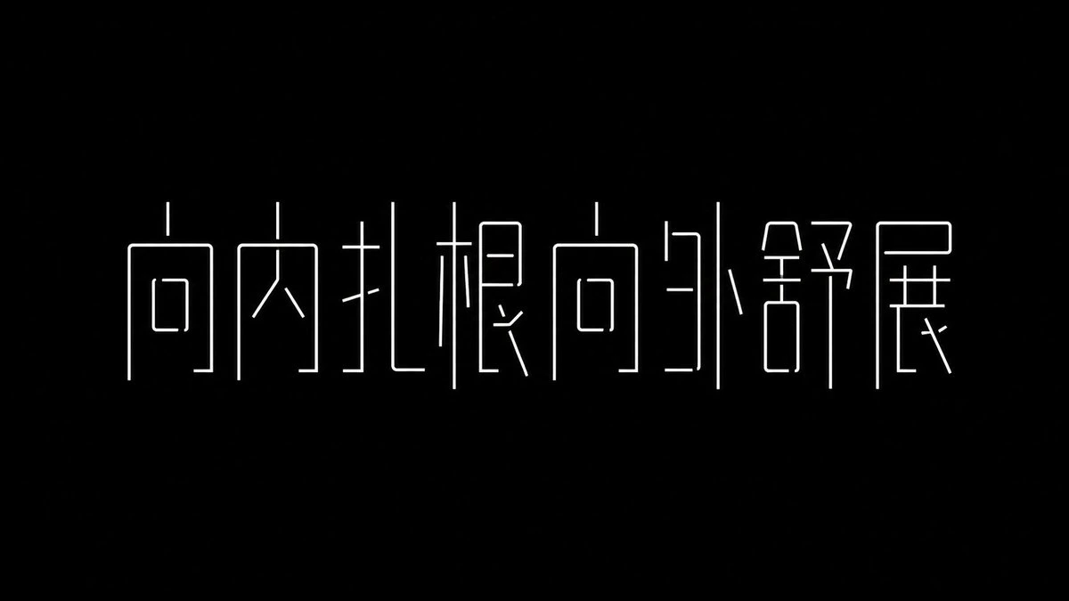
Complete AI image prompt
Make the lettering itself the sole visual subject: a sequence of extremely condensed, elongated, architectural glyphs that remains unambiguously readable in the chosen writing system. Let the theme determine the exact wording, semantic emphasis, and script, then redistribute each glyph’s native components without violating its essential orthographic topology. Extend primary vertical strokes into full-height structural columns, reduce secondary horizontals to hairline connectors, and rebuild radicals or letter parts with narrow rectangular counters, framed cavities, sharp diagonal cuts, wedge terminals, and short cantilevered marks. Selected strokes may separate, shift, merge, or project beyond the nominal glyph body; use continuity and perceptual closure so the surrounding void completes every interrupted contour and legibility precedes abstraction. Set the entire phrase on one shared baseline and an implied modular grid, with nearly uniform height and controlled width variation from ultra-condensed to moderately narrow. Establish a dense cadence of verticals, interrupted sparingly by thin crossbars and diagonals; optically adjust spacing by each glyph’s light-dark weight, allowing short text to read as isolated columns and longer text as a compact wall whose characters remain individually distinct. Hold this single primary message inside a broad, uninterrupted field of negative space, with generous breathing room on every side. The eye should travel steadily across repeated vertical axes and pause at irregular counters, gaps, and bevels; omit secondary copy, imagery, and decorative layers. Choose one coherent global rendering state according to the theme’s emotional temperature. In the solid state, use flat pure-black glyphs on luminous pure white, with massive verticals, near-hairline horizontals, and white cutouts producing forceful figure-ground exchange. In the monoline state, reverse to uniformly thin white strokes on deep black, resolving the same skeleton as open contours, squared loops, restrained short nodes, and gently rounded line ends. Keep one state, one stroke logic, and one strict monochrome polarity throughout. Use even flat fields, crisp continuous edges, and exact junctions; all expression must come from glyph topology, compression, and spatial rhythm, yielding a cool, experimental, machine-precise yet understated custom-lettering system for any subject.
Original style prompt
Make the lettering itself the sole visual subject: a sequence of extremely condensed, elongated, architectural glyphs that remains unambiguously readable in the chosen writing system. Let the theme determine the exact wording, semantic emphasis, and script, then redistribute each glyph’s native components without violating its essential orthographic topology. Extend primary vertical strokes into full-height structural columns, reduce secondary horizontals to hairline connectors, and rebuild radicals or letter parts with narrow rectangular counters, framed cavities, sharp diagonal cuts, wedge terminals, and short cantilevered marks. Selected strokes may separate, shift, merge, or project beyond the nominal glyph body; use continuity and perceptual closure so the surrounding void completes every interrupted contour and legibility precedes abstraction. Set the entire phrase on one shared baseline and an implied modular grid, with nearly uniform height and controlled width variation from ultra-condensed to moderately narrow. Establish a dense cadence of verticals, interrupted sparingly by thin crossbars and diagonals; optically adjust spacing by each glyph’s light-dark weight, allowing short text to read as isolated columns and longer text as a compact wall whose characters remain individually distinct. Hold this single primary message inside a broad, uninterrupted field of negative space, with generous breathing room on every side. The eye should travel steadily across repeated vertical axes and pause at irregular counters, gaps, and bevels; omit secondary copy, imagery, and decorative layers. Choose one coherent global rendering state according to the theme’s emotional temperature. In the solid state, use flat pure-black glyphs on luminous pure white, with massive verticals, near-hairline horizontals, and white cutouts producing forceful figure-ground exchange. In the monoline state, reverse to uniformly thin white strokes on deep black, resolving the same skeleton as open contours, squared loops, restrained short nodes, and gently rounded line ends. Keep one state, one stroke logic, and one strict monochrome polarity throughout. Use even flat fields, crisp continuous edges, and exact junctions; all expression must come from glyph topology, compression, and spatial rhythm, yielding a cool, experimental, machine-precise yet understated custom-lettering system for any subject.
More open images in the “Typography & Posters · X Archive · 259” style