

Open prompts
sample 08 AI Image Prompt
sample 08, its complete AI image prompt, and the Good Morning & Daily Greetings · Good Morning · 168 style are free to view and copy.
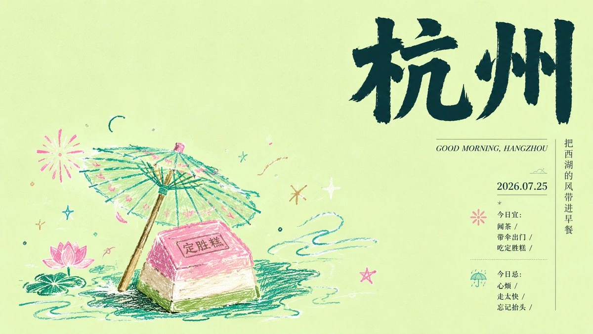
Complete AI image prompt
Make an oversized hand-lettered rendering of the theme name the immediate visual anchor. Keep the writing system orthographically valid and legible, while giving the glyphs brush- or broad-pencil pressure, naturally uneven stroke modulation, open counters, varied terminals, relaxed spacing, and a warm human rhythm. Tuck a few short flat-color bars beneath selected strokes like highlighter beats, deriving one to three bright accents from the theme’s emotional register. Build a decisive scale jump from the dominant lettering to tiny secondary copy: a restrained foreign-language subtitle, date, brief message, and compact information lines generated from the theme, all set with fine weight, generous tracking, and editorial precision. Govern the space through a three-stage reading sequence—display lettering, thematic imagery, micro-information—separated by abundant breathing room; balance the unequal masses asymmetrically with distant color ticks, hairlines, and small hand-drawn marks, allowing only one controlled break across the implied grid. Let thematic meaning determine the secondary image treatment. If the subject depends on place, sequence, or observation, divide its evidence into clean-edged rectangular image modules of varied scale, lock them to shared baselines, and alternate wide context with intimate detail to create a quiet visual narrative. If the subject depends more on symbol and emotion, condense its central carrier, theme-derived attachments, and information cues into a clear crayon focal group, drawn with repeated loose contours, dry wax drag on paper, occasional strokes extending beyond the outline, and deliberately naive yet recognizable forms. Keep each chosen image language internally consistent, with a calm field and a single unmistakable focus. Use either luminous warm white or one pale theme-derived color as a broad matte paper field. Extract the subject palette from its native associations: deep ink controls the title and contour structure, softened supporting hues occupy the imagery, and sparse high-chroma notes appear only in bars, select strokes, and marginal symbols. Maintain a high-key, compressed color range and gentle translucent light; photographic imagery carries low contrast, mild warm highlights, and clear morning air, while crayon imagery uses dry layered pigment against an even paper field. Add only a few marginal annotations—fine lines, dots, starbursts, arcs, or small theme-derived pictograms—to redirect the eye without competing with the lettering. The finished system should feel quiet, alert, lightly playful, and shaped by an everyday sense of occasion.
Original style prompt
Make an oversized hand-lettered rendering of the theme name the immediate visual anchor. Keep the writing system orthographically valid and legible, while giving the glyphs brush- or broad-pencil pressure, naturally uneven stroke modulation, open counters, varied terminals, relaxed spacing, and a warm human rhythm. Tuck a few short flat-color bars beneath selected strokes like highlighter beats, deriving one to three bright accents from the theme’s emotional register. Build a decisive scale jump from the dominant lettering to tiny secondary copy: a restrained foreign-language subtitle, date, brief message, and compact information lines generated from the theme, all set with fine weight, generous tracking, and editorial precision. Govern the space through a three-stage reading sequence—display lettering, thematic imagery, micro-information—separated by abundant breathing room; balance the unequal masses asymmetrically with distant color ticks, hairlines, and small hand-drawn marks, allowing only one controlled break across the implied grid. Let thematic meaning determine the secondary image treatment. If the subject depends on place, sequence, or observation, divide its evidence into clean-edged rectangular image modules of varied scale, lock them to shared baselines, and alternate wide context with intimate detail to create a quiet visual narrative. If the subject depends more on symbol and emotion, condense its central carrier, theme-derived attachments, and information cues into a clear crayon focal group, drawn with repeated loose contours, dry wax drag on paper, occasional strokes extending beyond the outline, and deliberately naive yet recognizable forms. Keep each chosen image language internally consistent, with a calm field and a single unmistakable focus. Use either luminous warm white or one pale theme-derived color as a broad matte paper field. Extract the subject palette from its native associations: deep ink controls the title and contour structure, softened supporting hues occupy the imagery, and sparse high-chroma notes appear only in bars, select strokes, and marginal symbols. Maintain a high-key, compressed color range and gentle translucent light; photographic imagery carries low contrast, mild warm highlights, and clear morning air, while crayon imagery uses dry layered pigment against an even paper field. Add only a few marginal annotations—fine lines, dots, starbursts, arcs, or small theme-derived pictograms—to redirect the eye without competing with the lettering. The finished system should feel quiet, alert, lightly playful, and shaped by an everyday sense of occasion.
More open images in the “Good Morning & Daily Greetings · Good Morning · 168” style