

Open prompts
sample 08 AI Image Prompt
sample 08, its complete AI image prompt, and the Typography & Posters · Paper Texture · Bright · 261 style are free to view and copy.
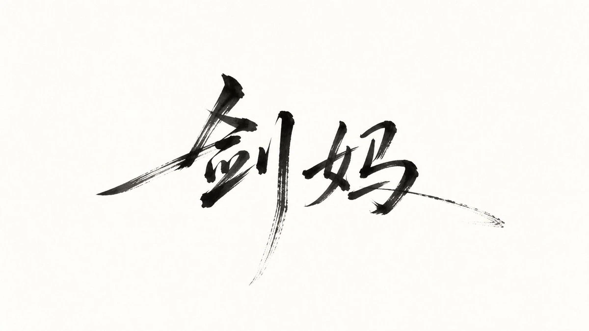
Complete AI image prompt
Build the first read around a single dominant mass of expressive hand lettering that carries the subject’s core message. Preserve valid, clearly recognizable glyph topology in the requested writing system while reshaping it through forceful brush choreography: broad load-bearing strokes and dense inked cores snap into hairline connections, dramatically extended diagonals, hooked turns, and needle-sharp terminals; let parallel bristle traces appear inside selected dry sweeps as pigment naturally falls from a saturated body to a split, tapering tip. Vary glyph width, scale, center of gravity, and baseline with controlled irregularity, then restore coherence through a continuous directional silhouette, legible reading order, and implied closure across intentional gaps. Make the lettering vastly outweigh every supporting element. Let its overall gesture spread expansively, anchored by one or two long vertical strokes; bring several terminal sweeps close to the outer field while retaining generous breathing room. Balance compact overlaps within the word group against a broad, quiet surrounding field. Lead the eye along a rising diagonal or wave-like stroke path, arrest it at the heaviest glyph core, then release it through cross-glyph hairlines, returning arcs, and elongated flicks. Translate the subject’s meaning into stroke direction, tension, pacing, and a restrained set of derived marks; use only tiny dots, blade-like dashes, glints, orbital curves, or abbreviated contours near the brush tips, all continuing the same motion and creating near-far rhythm rather than forming a separate illustration. Place this system on one dominant high-key field, selecting one of two bounded but related material expressions according to the subject’s emotional temperature: for an open, buoyant tone, use a continuous saturated color field or smooth luminosity drift with bright reverse-color lettering laid down as clean, solid shapes and a localized glow confined to the field edge; for a concentrated, contemplative tone, use warm pale paper and deep liquid ink, with pooled density in the load-bearing strokes, genuine bristle separation and absorbent edges only along the extended tips, while the surrounding paper remains spacious and calm. Reduce secondary information to tiny light geometric type with wide tracking, short rules, and separator dots, creating a sharp scale-and-order counterpoint to the gestural lettering; derive its wording, script, and color from the subject’s information hierarchy. Maintain crisp high contrast, airborne speed, disciplined emptiness, and the sense that every brush extension simultaneously acts as language, directional force, and moving air.
Original style prompt
Build the first read around a single dominant mass of expressive hand lettering that carries the subject’s core message. Preserve valid, clearly recognizable glyph topology in the requested writing system while reshaping it through forceful brush choreography: broad load-bearing strokes and dense inked cores snap into hairline connections, dramatically extended diagonals, hooked turns, and needle-sharp terminals; let parallel bristle traces appear inside selected dry sweeps as pigment naturally falls from a saturated body to a split, tapering tip. Vary glyph width, scale, center of gravity, and baseline with controlled irregularity, then restore coherence through a continuous directional silhouette, legible reading order, and implied closure across intentional gaps. Make the lettering vastly outweigh every supporting element. Let its overall gesture spread expansively, anchored by one or two long vertical strokes; bring several terminal sweeps close to the outer field while retaining generous breathing room. Balance compact overlaps within the word group against a broad, quiet surrounding field. Lead the eye along a rising diagonal or wave-like stroke path, arrest it at the heaviest glyph core, then release it through cross-glyph hairlines, returning arcs, and elongated flicks. Translate the subject’s meaning into stroke direction, tension, pacing, and a restrained set of derived marks; use only tiny dots, blade-like dashes, glints, orbital curves, or abbreviated contours near the brush tips, all continuing the same motion and creating near-far rhythm rather than forming a separate illustration. Place this system on one dominant high-key field, selecting one of two bounded but related material expressions according to the subject’s emotional temperature: for an open, buoyant tone, use a continuous saturated color field or smooth luminosity drift with bright reverse-color lettering laid down as clean, solid shapes and a localized glow confined to the field edge; for a concentrated, contemplative tone, use warm pale paper and deep liquid ink, with pooled density in the load-bearing strokes, genuine bristle separation and absorbent edges only along the extended tips, while the surrounding paper remains spacious and calm. Reduce secondary information to tiny light geometric type with wide tracking, short rules, and separator dots, creating a sharp scale-and-order counterpoint to the gestural lettering; derive its wording, script, and color from the subject’s information hierarchy. Maintain crisp high contrast, airborne speed, disciplined emptiness, and the sense that every brush extension simultaneously acts as language, directional force, and moving air.
More open images in the “Typography & Posters · Paper Texture · Bright · 261” style