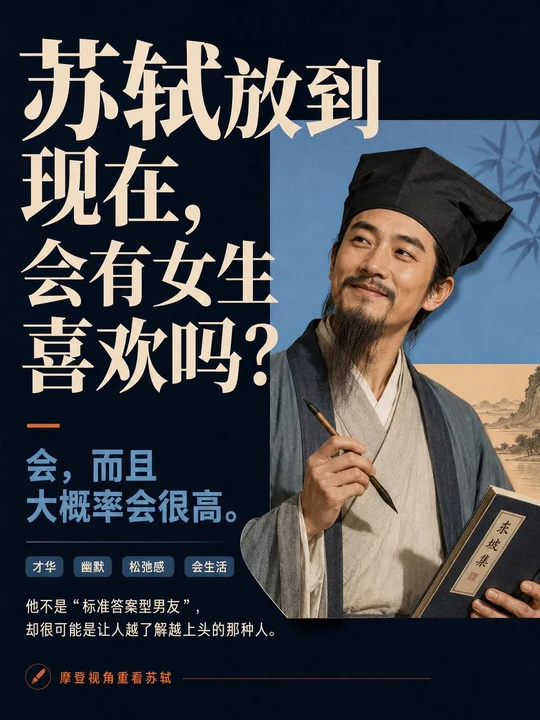
 sample 01Presentations & Courseware · Paper Texture · Bright · 282
prompt library
成员提示词库
-
套提示词风格
- 全量解锁提示词、参数与案例
- 持续上新新提示词与实用场景
- 作者答疑使用问题直接沟通
正在确认当前可用的年度方案…
zhishixingqiu
知识星球
扫码加入星球,持续获取提示词更新、插件资料和项目答疑;星球会员也可以解锁成员提示词库。
 扫码或点击加入知识星球
认识小小东
添加微信,获取提示词、插件、Skills 与 AI 出图支持

扫描,添加小小东个人微信
built by xiaoxiaodong
我开发的项目
谷歌插件和 GitHub 项目分开展示
16 个可用项目chrome web store
谷歌插件
github
GitHub 项目
正在计算符合当前颜色的内容…
你已看完 10 页免费内容
开通 VIP,解锁完整提示词库。
开源 Skills
Skills
浏览小小东开源的 Codex / Agent Skills。按现有瀑布流节奏展开,找到合适的能力后即可复制安装命令。
正在加载 Skills…
没有找到匹配的 Skill。
Open prompts
Presentations & Courseware
5 real examples in the Presentations & Courseware · Paper Texture · Bright · 282 style, with complete prompts available to copy without signing in.
Original style prompt
Build the first read around an oversized, high-contrast display headline stacked in several tightly spaced lines, carrying roughly twice the visual weight of the main thematic carrier. Let the type establish a firm axis, then create one controlled grid violation as the carrier crosses a column, overlaps a color plane, or cuts into the headline boundary; subordinate content recedes into a much smaller explanatory tier and guides the eye from headline to carrier, modular evidence, and closing statement. Derive all semantics from the subject itself: its most recognizable person, object, setting, or abstract form becomes a crisply isolated carrier, while its own symbols, attachments, gestures, narrative cues, and information priorities determine the imagery. Render that carrier with credible detail, soft directional light, clean contours, selective overlap, and figure-ground exchange against the framework. Construct the headline in a classical high-contrast serif display anatomy valid for the required writing system, with upright proportions, decisive thick-thin modulation, sharp wedge-like terminals, open counters, tight line spacing, and intact orthographic recognition; enlarge punctuation or a key phrase as a secondary typographic beat. Set supporting copy in a sturdy low-contrast sans or restrained text face, using an extreme but orderly jump in size, density, and weight. Organize the page system through an asymmetrically balanced compound grid: the headline or carrier acts as the dominant mass, while generous open space, a color block, an illustration window, or small modules provide a distant light counterweight. Sparse pages preserve broad breathing fields; dense pages break information into crisp modular tiles that alternate short headings, concise explanations, thematic imagery, and symbols through shifts of value, scale, and image density. Compress secondary facts into consistent monoline circular icons, short rules, pill-shaped tags, numerals, quotations, and a final summary band, all aligned to a shared baseline. Maintain two complementary page modes, a deep cool field and a warm paper-white field, while allowing subject meaning to derive the exact hues within a low-saturation hierarchy: cream for dominant type, mid-value muted blue for explanation, and one burnt-orange accent restricted to rules, quotation marks, icons, or key words. Use an even matte paper field and clean flat color planes; translate the subject environment into low-contrast monochrome linework, pale ink-like distance imagery, or a restrained archival vignette visible only at edges, inside selected modules, and behind the carrier, adding cultural context and depth without competing with the headline. Keep photography, illustration, lettering, and geometry tonally unified with crisp boundaries, producing a coherent editorial knowledge system that feels analytical, cultivated, and quietly humane.
sample 01Presentations & Courseware · Paper Texture · Bright · 282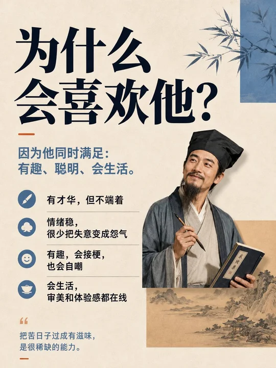 sample 02Presentations & Courseware · Paper Texture · Bright · 282
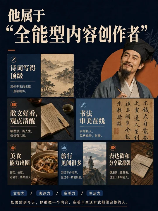 sample 03Presentations & Courseware · Paper Texture · Bright · 282
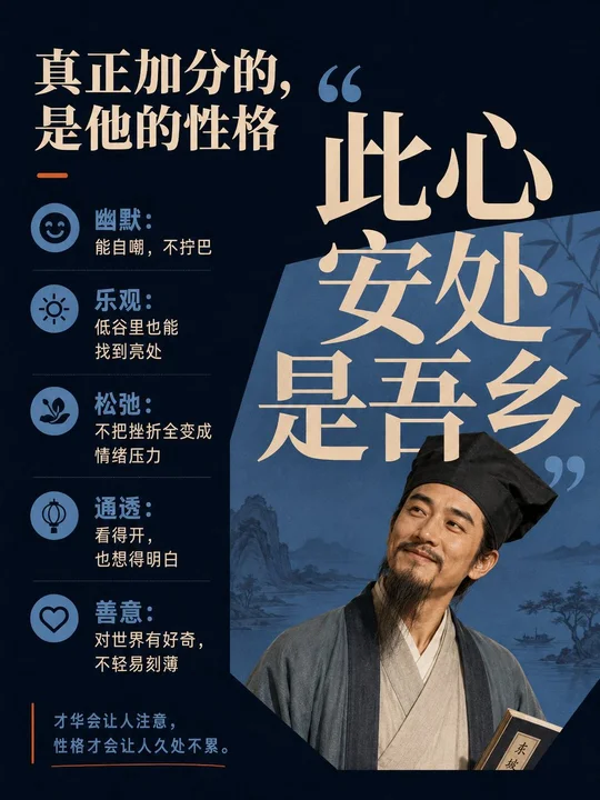 sample 04Presentations & Courseware · Paper Texture · Bright · 282
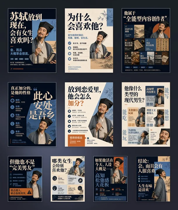 sample 05Presentations & Courseware · Paper Texture · Bright · 282
正在计算符合当前颜色的内容…
VIP 收录全部风格 每周持续新增,开源的只是其中一小部分。
还没有通知
有新通知时会出现在这里。
批量管理
正在建设中,预计一周后内上线。
已选 0 组
点击卡片选择或取消,删除后无法恢复