 sample 01Typography & Posters · X Archive · 233
prompt library
成员提示词库
-
套提示词风格
- 全量解锁提示词、参数与案例
- 持续上新新提示词与实用场景
- 作者答疑使用问题直接沟通
正在确认当前可用的年度方案…
zhishixingqiu
知识星球
扫码加入星球,持续获取提示词更新、插件资料和项目答疑;星球会员也可以解锁成员提示词库。
 扫码或点击加入知识星球
认识小小东
添加微信,获取提示词、插件、Skills 与 AI 出图支持

扫描,添加小小东个人微信
built by xiaoxiaodong
我开发的项目
谷歌插件和 GitHub 项目分开展示
16 个可用项目chrome web store
谷歌插件
github
GitHub 项目
正在计算符合当前颜色的内容…
你已看完 10 页免费内容
开通 VIP,解锁完整提示词库。
开源 Skills
Skills
浏览小小东开源的 Codex / Agent Skills。按现有瀑布流节奏展开,找到合适的能力后即可复制安装命令。
正在加载 Skills…
没有找到匹配的 Skill。
Open prompts
Typography & Posters
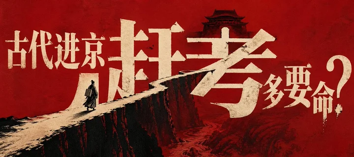
1 real examples in the Typography & Posters · X Archive · 233 style, with complete prompts available to copy without signing in.
Original style prompt
Turn the theme’s core wording into a monumental, fully legible landform: the main glyphs must simultaneously read as language and operate as cliffs, bridge planes, and a narrow traversable route, so reading the headline and entering the scene become the same perceptual event. Drive a theme-derived wedge path from a broad near edge toward a sharply narrowed distant focus; its warm paper-white top catches the eye while a sheer charcoal-black face plunges into depth, with a few theme-native marks pulled downward along that face to amplify height. Place a single miniature theme-derived actor or vehicle on the route and reduce the distant destination to a compact black symbolic silhouette; their extreme scale difference must communicate solitary movement and imminent arrival, while their literal identities come entirely from the applied theme. Set the headline in the writing system required by the theme, preserving correct orthography while using an oversized high-contrast display construction: massive primary stems, sharp wedge terminals, compressed counters, selectively extended strokes, and tightly interlocking glyphs. Let the lettering cross the background and physically join or occlude the path. Build the secondary copy from smaller, upright, fine-edged letterforms close to the main mass, then end the reading sequence with an enormous punctuation mark or theme-specific sign that creates a suspended final beat; retain a decisive three-tier jump in scale. Govern the space through dynamic equilibrium around a forceful diagonal: the giant lettering supplies the stable visual center, the path pierces that mass through continuity, the distant symbol arrests the vector, and marginal text provides a light counterweight across the field. The dominant type-and-terrain mass must greatly outweigh all supporting information; preserve a continuous open color field around key contours, press the foreground form against and beyond an edge, and pace the eye through supporting copy, monumental glyphs, miniature traveler, destination symbol, and terminal mark. Use a three-plate limited-ink system: let the theme’s emotional temperature select one highly saturated warm hue as the overwhelming field, assign warm fibrous paper white to typography and illuminated route surfaces, and reserve dense charcoal black for silhouettes, precipice faces, and deepest spatial cuts. Keep these colors in strongly unequal areas so light-dark and extension contrast create the tension. Within the dominant field, embed low-contrast topography, currents, or narrative traces derived from the theme, confined mainly to lower and distant layers; their slow circulation should extend the abyss while leaving the lettering as the first read. Render through coarse-mesh screenprinting fused with woodcut-like plate work: allow the dominant ink to absorb into fibrous stock, give black shapes crisp yet intermittently cut edges, and create sparse pinpricks of exposed field through under-inking and fiber absorption only inside solid paper-white glyph masses and the route surface. Keep small lettering and recognition-critical contours fully formed. The result should gain monumentality, danger, historical weight, and immediate impact from this locked union of typography, spatial narrative, limited ink, and carved edge behavior.
sample 01Typography & Posters · X Archive · 233正在计算符合当前颜色的内容…
VIP 收录全部风格 每周持续新增,开源的只是其中一小部分。
还没有通知
有新通知时会出现在这里。
批量管理
正在建设中,预计一周后内上线。
已选 0 组
点击卡片选择或取消,删除后无法恢复