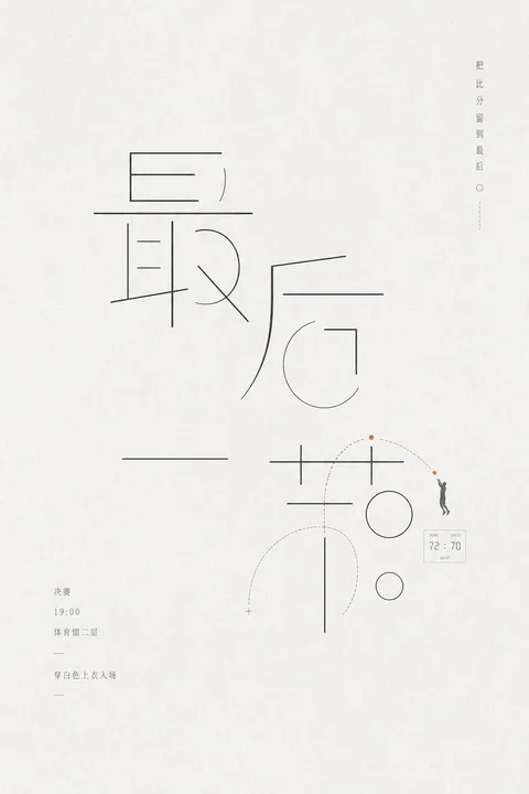
 sample 01Typography & Posters · Bright · Minimal · 248
prompt library
成员提示词库
-
套提示词风格
- 全量解锁提示词、参数与案例
- 持续上新新提示词与实用场景
- 作者答疑使用问题直接沟通
正在确认当前可用的年度方案…
zhishixingqiu
知识星球
扫码加入星球,持续获取提示词更新、插件资料和项目答疑;星球会员也可以解锁成员提示词库。
 扫码或点击加入知识星球
认识小小东
添加微信,获取提示词、插件、Skills 与 AI 出图支持

扫描,添加小小东个人微信
built by xiaoxiaodong
我开发的项目
谷歌插件和 GitHub 项目分开展示
16 个可用项目chrome web store
谷歌插件
github
GitHub 项目
正在计算符合当前颜色的内容…
你已看完 10 页免费内容
开通 VIP,解锁完整提示词库。
开源 Skills
Skills
浏览小小东开源的 Codex / Agent Skills。按现有瀑布流节奏展开,找到合适的能力后即可复制安装命令。
正在加载 Skills…
没有找到匹配的 Skill。
Open prompts
Typography & Posters
4 real examples in the Typography & Posters · Bright · Minimal · 248 style, with complete prompts available to copy without signing in.
Original style prompt
Make the theme’s key wording the dominant graphic event, preserving correct orthographic recognition in the chosen writing system while rebuilding each glyph as an ultra-thin, uniform, deep-charcoal framework of straight strokes, right-angle turns, circular arcs, and open counters. Expand the internal intervals, extend a few structural strokes far beyond their normal joins, omit selected secondary connections, and let neighboring glyphs borrow an axis, circle, or rectangular enclosure; continuity and closure should allow the eye to complete the interrupted forms, so the lettering reads simultaneously as language and as an abstract wayfinding system. Establish one dramatically oversized glyph cluster as the primary mass, with remaining characters allowed to unfold in airy runs, staggered tiers, or separated echoes, all disciplined by an implied modular grid and baseline rhythm. Introduce only controlled departures: a small number of arcs escape their cells and long rules cross glyph boundaries. Keep the occupied structure localized within a much larger uninterrupted field, balancing the dominant lettering asymmetrically against remote annotations and isolated marks. Build a paced reading route from the giant linear skeleton through extended strokes, dotted trajectories, and long pauses toward peripheral information. Translate the theme’s meaning into one to three monoline symbols derived from its own structure: rings, crosses, corner frames, calibration ticks, path arcs, or another reduced thematic contour. Fit these into counters, substitute them for selected strokes, or use them as distant scale references, always matching the lettering’s stroke weight, crisp terminals, and geometric logic. A single tiny theme-derived silhouette or pictogram may serve as a scale anchor while the composition remains diagrammatic and two-dimensional. Set supporting information in very small, light-weight type with generous tracking, arranged as short lines, narrow columns, dates, figures, compact data boxes, or marginal vertical notes. Connect this microtype with short rules, fine enclosures, dashed leaders, and hollow locator dots; derive all wording, numbers, and hierarchy from the applied theme. Use an even high-key warm-white matte paper field with near-black and dark-gray linework. Extract only one or two restrained accent hues from the theme and confine them to tiny locator dots, brief rules, or a single critical node, activating sequence and hierarchy through extreme area contrast. Keep the line edges crisp and continuous and render every form as flat, constant-value linework in planar depth. The final character should be spare, precise, quiet, rational, and lightly human, driven by the causal unity of deconstructed glyphs, extreme scale shifts, completed negative forms, expansive intervals, and micro-information.
sample 01Typography & Posters · Bright · Minimal · 248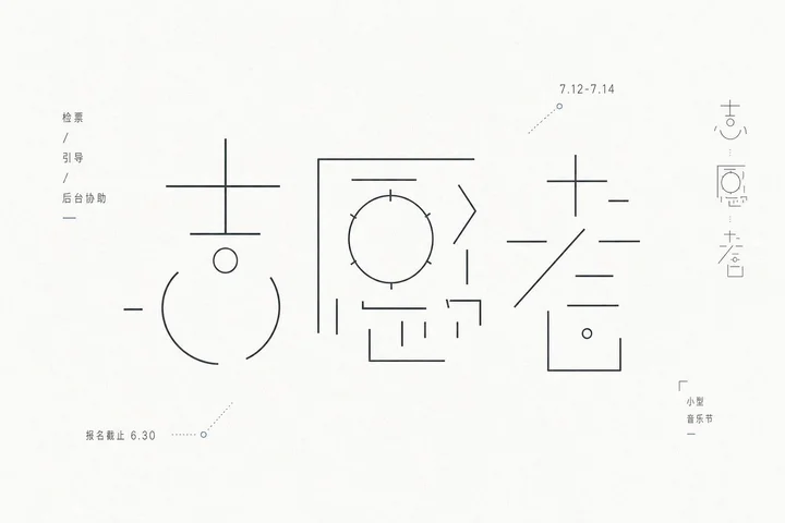 sample 02Typography & Posters · Bright · Minimal · 248
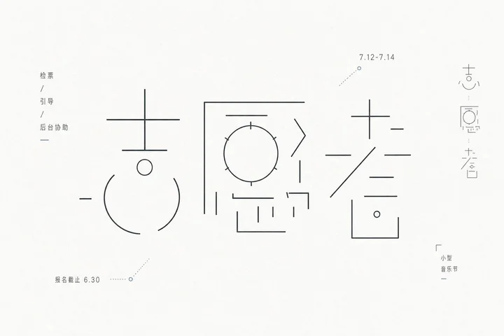 sample 03Typography & Posters · Bright · Minimal · 248
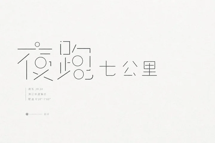 sample 04Typography & Posters · Bright · Minimal · 248
正在计算符合当前颜色的内容…
VIP 收录全部风格 每周持续新增,开源的只是其中一小部分。
还没有通知
有新通知时会出现在这里。
批量管理
正在建设中,预计一周后内上线。
已选 0 组
点击卡片选择或取消,删除后无法恢复