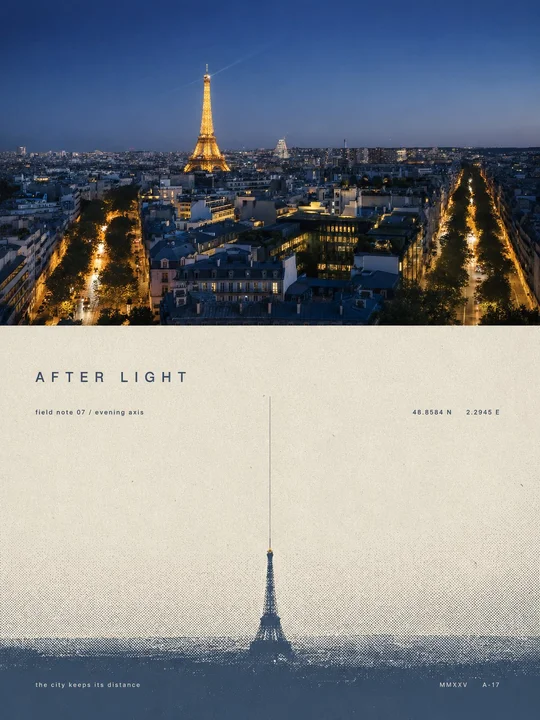
 en sample 01XXD Panel 009 · Halftone Anchor Print
prompt library
成员提示词库
-
套提示词风格
- 全量解锁提示词、参数与案例
- 持续上新新提示词与实用场景
- 作者答疑使用问题直接沟通
正在确认当前可用的年度方案…
zhishixingqiu
知识星球
扫码加入星球,持续获取提示词更新、插件资料和项目答疑;星球会员也可以解锁成员提示词库。
 扫码或点击加入知识星球
认识小小东
添加微信,获取提示词、插件、Skills 与 AI 出图支持

扫描,添加小小东个人微信
built by xiaoxiaodong
我开发的项目
谷歌插件和 GitHub 项目分开展示
16 个可用项目chrome web store
谷歌插件
github
GitHub 项目
正在计算符合当前颜色的内容…
你已看完 10 页免费内容
开通 VIP,解锁完整提示词库。
开源 Skills
Skills
浏览小小东开源的 Codex / Agent Skills。按现有瀑布流节奏展开,找到合适的能力后即可复制安装命令。
正在加载 Skills…
没有找到匹配的 Skill。
Open prompts
XXD Panel 009
12 real examples in the XXD Panel 009 · Halftone Anchor Print style, with complete prompts available to copy without signing in.
Original style prompt
Please make every photo I upload into its own standalone high-end design poster; no multi-image collages, each photo output separately. The overall composition uses a 3:4 vertical format, with the upper and lower zones strictly 1:1 in height, each taking up 50% of the frame.

The upper half keeps the original photo, preserving the subject's structure, real texture, natural light and shadow, and original color atmosphere, applying only a slight high-end photographic color grade so that it carries the texture of art magazines and exhibition photography. To fit the frame, the sky, ground, or surrounding background may be extended naturally, but the subject must not be stretched, distorted, or altered.

The lower half extracts the most recognizable **subject, outline, pose, and narrative relationships** from the photo, compresses the complex information into a single visual anchor, and reconstructs it as a minimalist screen print and halftone print poster. Do not trace the photo or add rich illustrative details. Retain only the single most critical shape, action, or spatial relationship, allowing the subject to remain instantly recognizable with extremely little information.

The composition follows “**one subject, one direction, one spatial relationship**.” The subject usually remains at a small scale, using large areas of negative space to create a sense of distance and poetry. Based on the relationships inherent in the original image, choose only the single most natural structure: horizontal extension, vertical extension, isolated suspension, outward dissipation, or progression from shallow to deep; do not use multiple compositional techniques at the same time. A single horizon, boundary, shadow, or halftone band may be used to establish space, making the blank space itself the main component of the image.

Do not directly copy the photo's colors. Instead, distill its overall color temperature, value, and mood and reorganize them into a limited spot-color system of **paper ground color + main ink color + haze-layer color**. Use off-white, warm gray, or natural paper color for large areas of negative space; use one calm, weighty composite color as the main ink color; then use lighter, grayer colors from the same family to represent air, distance, or layers. Keep the overall palette to 2–3 colors, building hierarchy through color area, value, and halftone density. An extremely small accent color is allowed only when it has clear narrative significance.

All mist, distance, shadows, dissipation, and spatial transitions use **halftone dots that naturally disappear from dense to sparse**; do not use digital blur or ordinary gradients. Preserve paper grain, screen-printing ink, slight misregistration, and uneven ink coverage, making the image look like an art print genuinely printed on old paper.

**Retain a small decorative text system with a sophisticated editorial feel.** Do not limit it to place names. Instead, derive an extremely short title from the photo's theme, emotion, time, action, material, distance, or metaphor in the user's specified target language, and pair it with micro body text, a number, year, chapter number, coordinate-like digits, an archival mark, or one understated sentence. The copy may be somewhat abstract, literary, and curatorial in tone and does not need to explain the image fully—for example, it may concern concepts such as “distance, stillness, passage, echo, boundary, time, light, and trace”—making it resemble editorial annotations in an art book, architecture journal, or independent exhibition.

The text itself must participate in the composition rather than being added to empty space afterward. Small text may be **arranged along the horizon, fitted to the subject's outline, used as a vertical visual axis, extended across a halftone boundary, hidden in negative shapes, or placed in relationships of occlusion, interweaving, interruption, and alignment with the subject**. Extremely fine vertical lines, short horizontal lines, numbers, and page-number-like symbols may also be used to establish rhythm with large areas of negative space. A word may be split apart, set vertically, widely letter-spaced, or partially obscured by graphics, but reading order must always be maintained.

Keep the text hierarchy restrained: **one extremely short main title + 1–3 groups of extremely small supporting text are enough**. Typography should reference sophisticated art publications and modernist editorial design, using restrained sans serif, gentle serif, or minimalist condensed typefaces. Create refinement through extreme contrast in type size, wide letter spacing, light font weights, superscripts and subscripts, small caps, and asymmetrical layout. Text colors should match the main ink color or haze-layer color and may carry slight misregistration and ink grain so that text and graphics belong to the same printing pass rather than the text appearing as a digital typesetting overlay.

Overall, pursue **extremely few elements, extremely large negative space, an extremely small subject, extremely strong order, and subtle, intelligent textual intervention**, presenting a sense of quiet, solitude, vastness, understatement, poetry, erudition, and collectibility. Avoid complex compositions, multiple focal points, meaningless decoration, large headlines that overwhelm the image, commercial advertising copy, ordinary gradients, cheap vintage filters, and a templated look.
en sample 01XXD Panel 009 · Halftone Anchor Print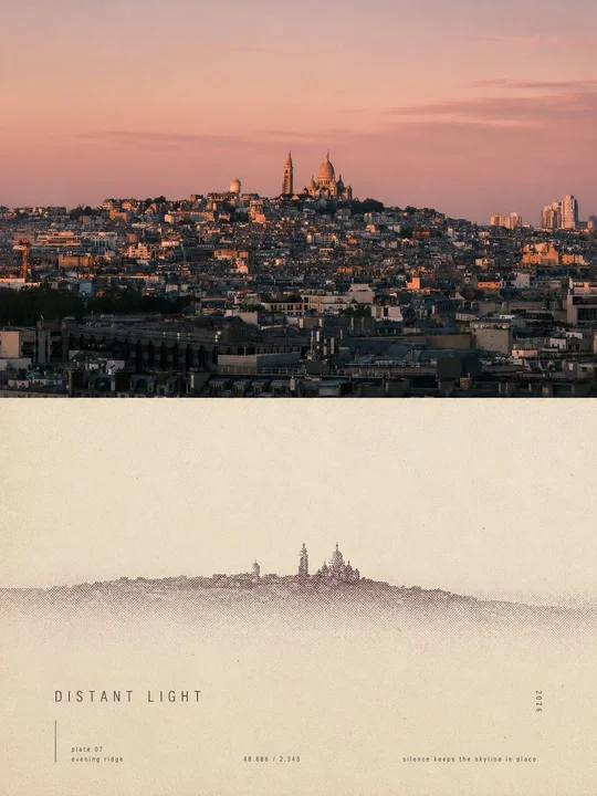 en sample 02XXD Panel 009 · Halftone Anchor Print
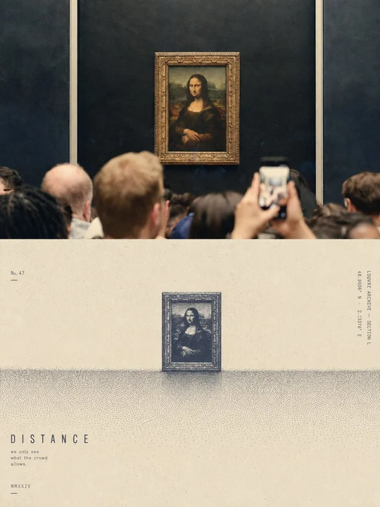 en sample 03XXD Panel 009 · Halftone Anchor Print
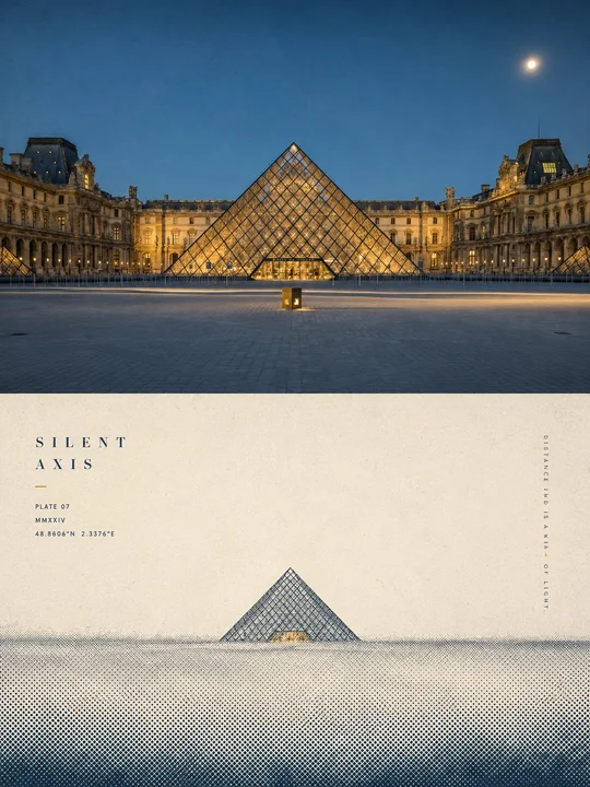 en sample 04XXD Panel 009 · Halftone Anchor Print
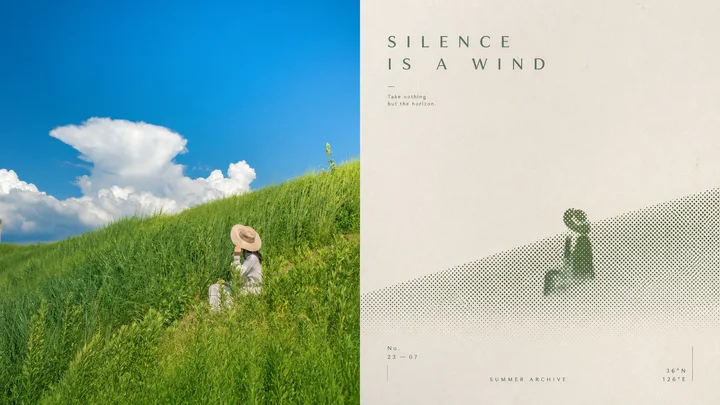 en sample 05XXD Panel 009 · Halftone Anchor Print
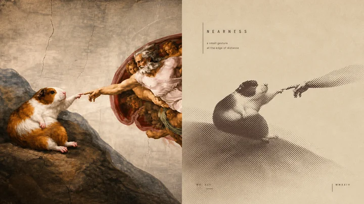 en sample 06XXD Panel 009 · Halftone Anchor Print
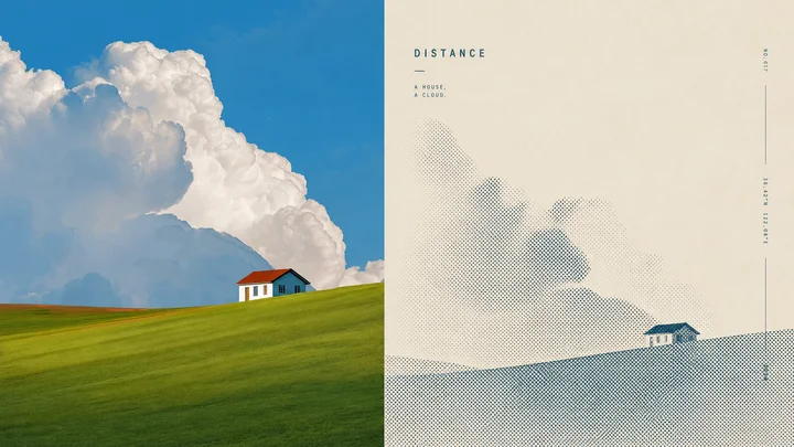 en sample 07XXD Panel 009 · Halftone Anchor Print
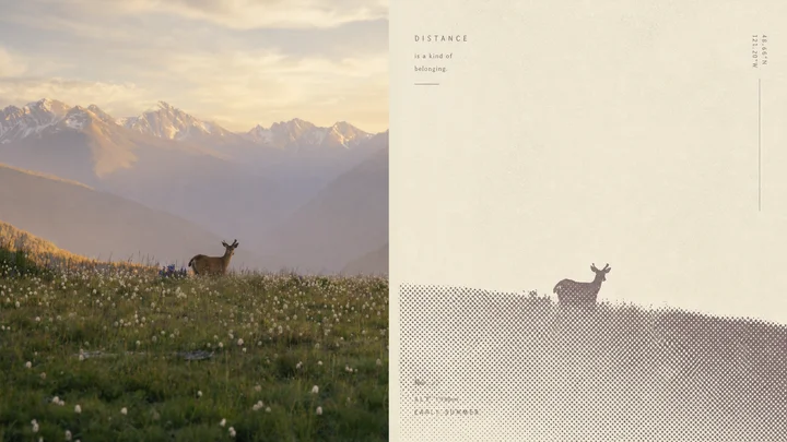 en sample 08XXD Panel 009 · Halftone Anchor Print
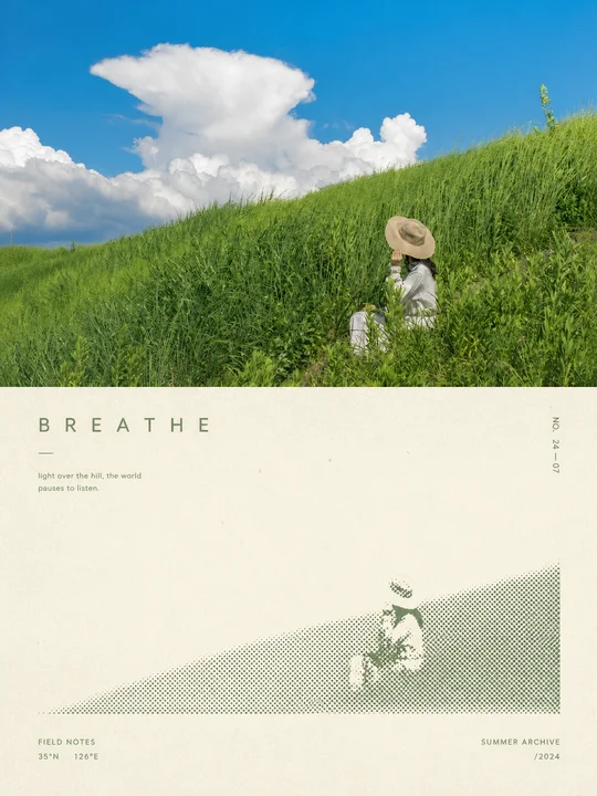 en sample 09XXD Panel 009 · Halftone Anchor Print
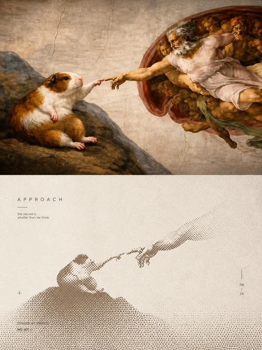 en sample 10XXD Panel 009 · Halftone Anchor Print
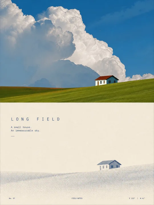 en sample 11XXD Panel 009 · Halftone Anchor Print
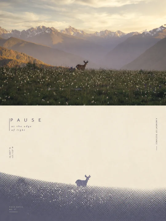 en sample 12XXD Panel 009 · Halftone Anchor Print
正在计算符合当前颜色的内容…
VIP 收录全部风格 每周持续新增,开源的只是其中一小部分。
还没有通知
有新通知时会出现在这里。
批量管理
正在建设中,预计一周后内上线。
已选 0 组
点击卡片选择或取消,删除后无法恢复