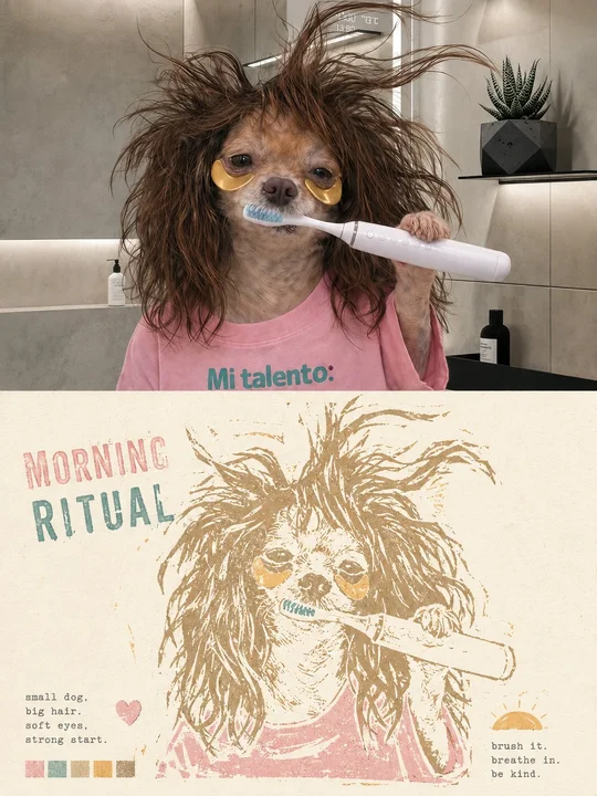
 en sample 01XXD Panel 049 · Woodcut Mark
prompt library
成员提示词库
-
套提示词风格
- 全量解锁提示词、参数与案例
- 持续上新新提示词与实用场景
- 作者答疑使用问题直接沟通
正在确认当前可用的年度方案…
zhishixingqiu
知识星球
扫码加入星球,持续获取提示词更新、插件资料和项目答疑;星球会员也可以解锁成员提示词库。
 扫码或点击加入知识星球
认识小小东
添加微信,获取提示词、插件、Skills 与 AI 出图支持

扫描,添加小小东个人微信
built by xiaoxiaodong
我开发的项目
谷歌插件和 GitHub 项目分开展示
16 个可用项目chrome web store
谷歌插件
github
GitHub 项目
正在计算符合当前颜色的内容…
你已看完 10 页免费内容
开通 VIP,解锁完整提示词库。
开源 Skills
Skills
浏览小小东开源的 Codex / Agent Skills。按现有瀑布流节奏展开,找到合适的能力后即可复制安装命令。
正在加载 Skills…
没有找到匹配的 Skill。
Open prompts
XXD Panel 049
12 real examples in the XXD Panel 049 · Woodcut Mark style, with complete prompts available to copy without signing in.
Original style prompt
Please make every photo I upload into its own standalone high-end design poster; no multi-image collages, each photo output separately. The overall composition uses a 3:4 vertical format, with the upper and lower zones strictly 1:1 in height, each taking up 50% of the frame.

The upper half retains the original photo, preserving the subject's identity, structure, pose, spatial relationships, real materials, natural light and shadow, and original color atmosphere, applying only a slight high-end photographic color grade so that it has the texture of independent magazines, art publications, and exhibition photography. To fit the frame, the sky, ground, or environmental background may be extended naturally, but the subject must not be stretched, distorted, mirrored, or altered.

The lower half extracts the most recognizable subject, outline, pose, and narrative relationships from the photo and reconstructs them as a limited-color woodcut print impression floating on the paper. Do not directly copy the entire photo or simply apply a filter; instead, actively remove complex backgrounds and fragmented information, retaining only the outlines, proportions, directions, divisions of light and dark, key structures, and core spatial relationships that determine recognizability. Re-summarize the subject through the language of woodcuts, linocuts, and hand registration, making it recognizable at a glance while giving it an artful character that is rustic, awkward, and strongly handmade.

The graphic strokes should carry the distinctive awkwardness and handmade traces of a woodcut print: lines need not be smooth or precise, and may show slight knife-cut hesitation, uneven thickness, fuzzy edges, stiff turns, local breaks, gaps, misregistration, and irregular negative space; the edges of color blocks may display dry brushing, incomplete printing, missing ink, and coarse-grained texture. The overall result is not a refined vector illustration, but should look as though it were carved and printed stroke by stroke with a hand carving tool and ink, carrying the plain, direct, slightly naive yet deeply enduring quality of a print.

The composition centers on a single visual anchor, large areas of negative space, and incomplete edges. Determine position and scale according to the subject's own visual center of gravity, direction of movement, and structural flow; it may be centered, offset, slightly cropped, or extended in a particular direction. Retain ample warm paper negative space around the subject, with edges gradually disappearing through missing ink, broken textures, exposed paper, and a sense of natural wear. Avoid a complete rectangular border, making the image feel like a memory lightly pressed onto paper.

Extract the most distinctive and vital colors from the photo above, but translate the overall palette into a fresh, gentle, soothing, and bright limited-color logic. Use clean and light composite hues such as cream white, ivory white, pale pink, mist green, light blue, tender yellow, pale orange, mint green, soft coral, and light ocher, maintaining low to medium saturation, high lightness, and gentle contrast. Preserve the most moving color-memory points from the original image, but avoid palettes that are dark, dull, dirty and aged, heavy, or excessively retro. All colors should resemble layers of matte physical ink applied through hand registration: soft and translucent, yet still retaining the grain and warmth of printmaking.

Text also enters as part of the print composition rather than as fixed explanatory copy. Distill a 1–3-word main title from the subject's identity, action, emotion, state, location, or metaphor in the photo, and pair it with a set of extremely short keywords or a miniature note. The main title may be arranged along the subject's outline, the boundary of the negative space, a visual axis, or the edge of the print, forming relationships of support, interweaving, misalignment, or correspondence with the graphic. Keep supporting text small and restrained, using a typewriter face, a monospaced serif, or archival-style typography, like annotations in a travel notebook or private print collection. Do not use a fixed year; let the text grow naturally from the photo itself.

Overall, emphasize the rustic handmade feel of woodcut printmaking, fresh and gentle limited colors, paper negative space, incomplete edges, and restrained typography, presenting a high-end printmaking character that is warm, quiet, soothing, light, and nostalgic without being gloomy. Whether the subject is a person, animal, plant, building, object, vehicle, or natural landscape, maintain a clear and ingenious visual correspondence between the real photography above and the reconstructed print below. Avoid ordinary filters, complete background replication, smooth vector outlines, cartoon illustration, a travel-template feel, and cheap retro styling.
en sample 01XXD Panel 049 · Woodcut Mark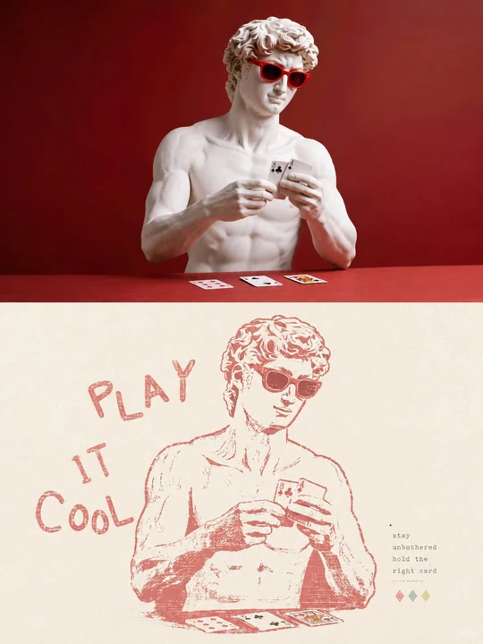 en sample 02XXD Panel 049 · Woodcut Mark
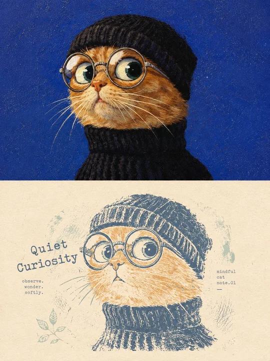 en sample 03XXD Panel 049 · Woodcut Mark
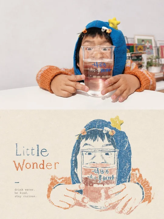 en sample 04XXD Panel 049 · Woodcut Mark
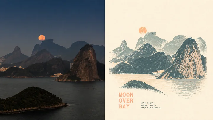 en sample 05XXD Panel 049 · Woodcut Mark
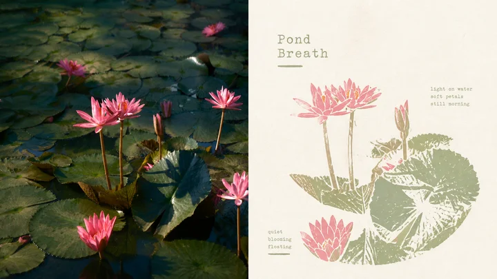 en sample 06XXD Panel 049 · Woodcut Mark
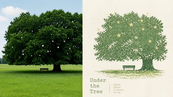 en sample 07XXD Panel 049 · Woodcut Mark
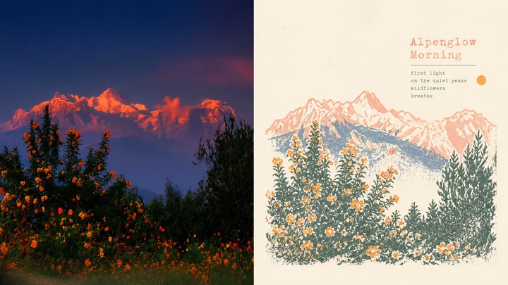 en sample 08XXD Panel 049 · Woodcut Mark
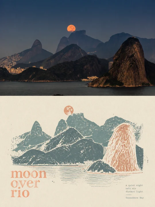 en sample 09XXD Panel 049 · Woodcut Mark
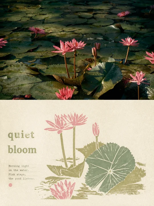 en sample 10XXD Panel 049 · Woodcut Mark
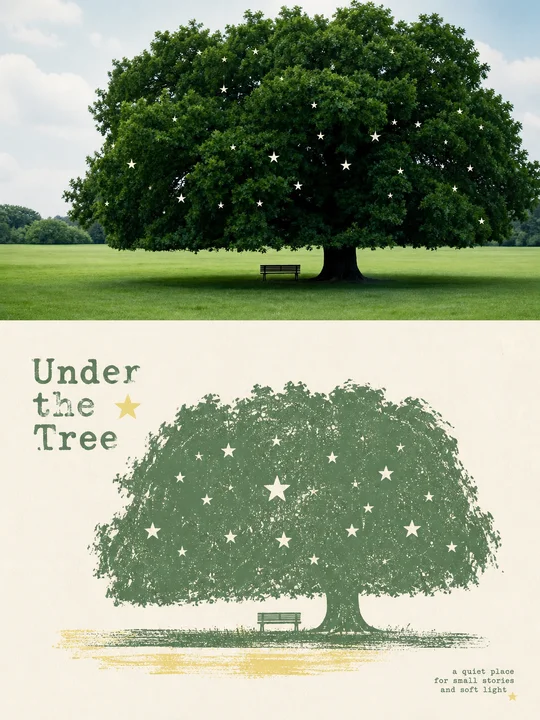 en sample 11XXD Panel 049 · Woodcut Mark
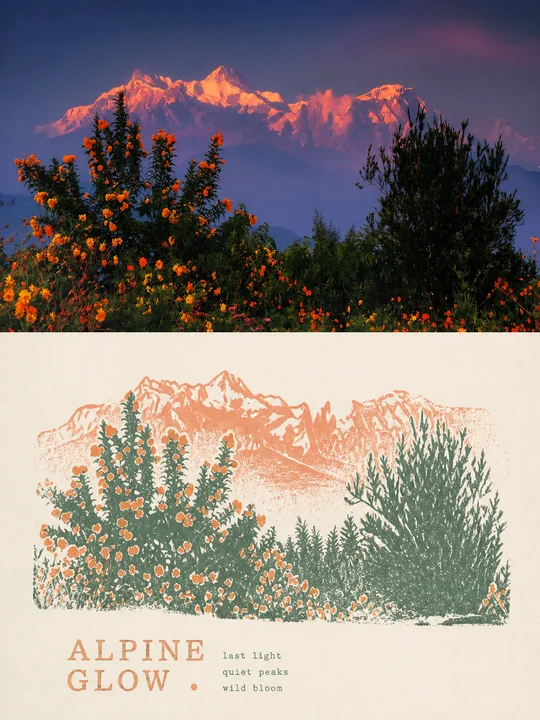 en sample 12XXD Panel 049 · Woodcut Mark
正在计算符合当前颜色的内容…
VIP 收录全部风格 每周持续新增,开源的只是其中一小部分。
还没有通知
有新通知时会出现在这里。
批量管理
正在建设中,预计一周后内上线。
已选 0 组
点击卡片选择或取消,删除后无法恢复