会员账号

Open prompts

XXD Panel 074

8 real examples in the XXD Panel 074 · Mood Icon Journal style, with complete prompts available to copy without signing in.

Original style prompt

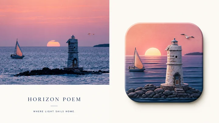
Please turn every photo I upload into its own standalone high-end design poster. Do not make a multi-image collage; output each photo separately. Use an overall 3:4 portrait composition, with the upper and lower regions in a strict 1:1 height ratio, each occupying 50% of the image.

The upper half retains the original photograph, preserving the subject's identity, structure, pose, authentic texture, natural light and shadow, and original colour atmosphere. Apply only subtle high-end grading so it feels appropriate for an art magazine, independent publication, or exhibition image. The surrounding environment may be extended naturally to fit the canvas, but the subject must not be stretched, distorted, or changed.

In the lower half, extract the photograph's most recognisable **subject, outline, structure, pose, and narrative relationships**. First understand the emotion, action, relationship, or visual metaphor truly worth preserving, then reorganise it as an original-concept **pseudo-3D rounded icon visual**. Do not merely shrink the photograph into an icon. Rebuild the source's “soul” with the fewest but most essential elements: recognise the subject at first glance, understand the relationship at second glance, and feel the original emotion at third glance.

The icon's outer silhouette must always remain a **standard 1:1 square rounded rectangle** with four equal sides, uniform corner radius, front-facing view, and stable proportions, like a complete and properly specified premium app icon. Do not stretch, squash, tilt, apply perspective distortion, turn it trapezoidal, or let the subject alter the outer icon boundary. The rounded square is a fixed visual stage; all creativity, space, and narrative occur inside it.

Inside the icon, use a **front-facing pseudo-3D / 2.5D spatial language**. The subject is the absolute visual core, surrounded only by a few environmental relationships that strengthen the narrative. Build rich dimensionality through credible front–back occlusion, volume thickness, height differences, soft facets, local relief, and spatial distance. Elements may occupy different depths, but they should grow naturally from one continuous space rather than stack as layers of cut paper. Avoid isometric dioramas, top-down models, paper layering, and complex realistic perspective.

Prioritise the source's most powerful **core visual relationship**. Proportion exaggeration, local enlargement, front–back interweaving, formal echoes, spatial compression, or symbolic conversion may strengthen the metaphor, but every change must serve one clear theme. Maintain a clear visual centre, distinct subject silhouette, and good negative space so the icon remains highly recognisable and memorable when reduced, rather than becoming a generic “object centred” template icon.

Derive colour **entirely from the upper source photograph, with no preset colour menu**. Identify the main colour that best represents identity and emotion, the most vital bright colour, and supporting colours that balance the space. Then remix them while preserving the source's hue memory: moderately **raise brightness, increase purity, remove dirty mixed colour, organise warm–cool relationships, separate hierarchy, and strengthen the most spirited colour**. The result may be more vivid, translucent, and alive than the photograph while still feeling naturally derived from it rather than another palette template. Avoid darkness, ageing, averaged colour sampling, unfocused multicolour, fluorescence, and cheap candy colour.

Use a **delicate, matte, soft modern pseudo-3D sculptural finish** between high-end editorial illustration, miniature art model, and branded 3D visual. Forms should have real volume and gentle hierarchy without becoming overly smooth, reflective, or CGI-like. Avoid cut-paper feeling, plastic-toy texture, glass-jelly material, metallic highlights, and game-UI styling.

Keep ample clean negative space around the lower design and show only this one complete rounded-square icon. If text is needed, use only a tiny amount of refined editorial type outside the icon, establishing a quiet, restrained relationship with the page. Add no surrounding decoration or visual noise.

The overall aim is **a fixed rounded-square stage + extraction of the source's soul + front-facing pseudo-3D depth + source-derived colour art direction + strong recognition and original metaphor**. The result should feel ready for a brand-identity proposal or icon-concept review, not like a photo thumbnail, paper-cut illustration, isometric model, or templated app icon.
正在加载…

找回密码

输入注册邮箱,我们会发送一封重置邮件。

确认删除

删除后将从网站中移除。

API 迁移

导入 API 配置