会员账号

Open prompts

XXD Panel 076

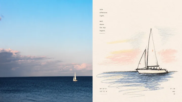
8 real examples in the XXD Panel 076 · Macaron Crayon style, with complete prompts available to copy without signing in.

Original style prompt

Turn every uploaded photograph into a separate high-end design poster. Do not combine multiple photographs; output each one independently. Use an overall 3:4 portrait composition with upper and lower regions of strictly equal height, each occupying 50% of the canvas.

Faithfully preserve the original photograph in the upper region. Accurately maintain subject identity and count, human or animal poses, architectural structure, terrain relationships, viewing angle, spatial direction, authentic materials, natural light and shadow, and the original colour atmosphere. Apply only subtle travel-magazine, independent-publication, and photography-exhibition grading with an extremely fine film grain. Do not turn it into an illustration, and do not move, add, remove, mirror, stretch, or reshape any subject.

In the lower region, extract the photograph's most recognisable **subject, contour, pose, and narrative relationship**, then reinterpret them as a **dark-crayon sketch with an Eastern sense of whitespace**. Do not copy the complete framing or describe every background element. Keep only the visual clues needed to preserve identity, scene meaning, and emotion, finding the form again through rough lines like dark crayon, charcoal, and coloured pencil. Contours may break, repeat, shift, and tremble slightly; local short hatching, rubbing, and layered lines may add weight, but key proportions, direction, and pose must remain accurate enough for immediate recognition.

Redesign the composition instead of inheriting the photograph's information density. Use the subject's **visual centre of gravity, direction of movement, positive–negative shape, and spatial tension** to choose offset, reduced, locally enlarged, or open composition. Control the image with an implicit grid and asymmetric balance. Concentrate the subject in one clear visual zone and actively remove the rest, preserving at least about 45% continuous whitespace. That emptiness should form one complete quiet field that can stand directly for sky, air, distance, water, or ground. A few lines, colour blocks, or partial contours may cross the main compositional boundary, creating surprise and breathing room within restraint.

Combine **dark-crayon sketch lines with a small amount of matte gouache or acrylic colour blocks**. Preserve paper tooth, waxy friction, granular broken lines, dry edges, exposed paper, and uneven coverage. Some areas may become slightly thicker and more solid, suggesting oil pastel or dry oil-paint strokes, but never a complete impasto treatment. Actively simplify complex vegetation, buildings, figures, and environmental texture rather than pursuing detailed realism.

Recompose colour from the upper photograph's **warmest, brightest, most vivid, and most humane clues** rather than copying literal values. Translate them into a high-key, clear, soft macaron palette that is never excessively sweet: cream apricot, peach pink, coral orange, butter yellow, sprout green, mint cyan, clear-sky blue, lavender purple, or other hues naturally derived from the source. Build depth through gentle warm–cool relationships. Colour should feel like a joyful memory left by sunlight, clothes, flowers, walls, and everyday details: bright but not glaring, soft but not grey. Dark crayon stabilises the composition, with a small amount of brighter warm yellow, pink-red, or coral as the emotional focus. Avoid forest-like dark green, dominant earthy brown, dirty grey Morandi treatment, nostalgic yellowing, fluorescent colour, and cheap candy styling.

Generate wording freely from the photograph's subject, place, action, memory, or emotion, without a fixed title or language. **Use small, restrained typewriter lettering with slight mechanical irregularity.** Arrange it along the subject's movement, the whitespace edge, the implicit grid, or between crayon lines. Loose tracking, tiny offsets, vertical setting, or incomplete alignment may create editorial rhythm. Text should behave like a private observation or a marginal note in an art publication, composing with the image rather than sitting over the illustration as a conventional title.

The whole result should combine **dark-crayon lines, bright macaron colour blocks, natural paper, extensive whitespace, and refined microtypography** into a humanist, restorative sensibility: warm, relaxed, perceptive, vivid, slightly awkward, yet governed by mature composition and art-publishing discipline. Avoid complete backgrounds, dense realistic detail, heavy comic outlines, cartooning, children's crayon aesthetics, tidy digital brushes, 3D rendering, e-commerce illustration, and template posters.
正在加载…

找回密码

输入注册邮箱,我们会发送一封重置邮件。

确认删除

删除后将从网站中移除。

API 迁移

导入 API 配置