会员账号

Open prompts

XXD Panel 079

8 real examples in the XXD Panel 079 · Pen-and-Wash Journal style, with complete prompts available to copy without signing in.

Original style prompt

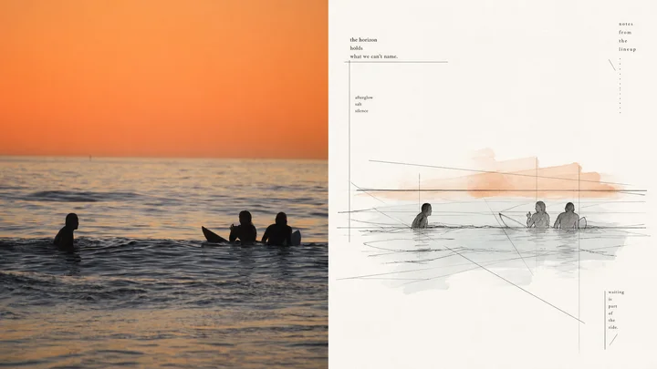
Please turn every photograph I upload into a separate high-end design poster. Do not create a multi-image collage; output each photograph independently. Use an overall 3:4 portrait composition with upper and lower regions in a strict 1:1 height ratio, each occupying 50% of the canvas.

Retain the original photograph in the upper half, preserving the subject's identity, structure, pose, authentic texture, natural light and shadow, and original colour atmosphere. Apply only subtle, refined colour grading so that it has the quality of an art magazine, independent publication, or exhibition image. The surrounding environment may be extended naturally to fit the format, but the subject must not be stretched, distorted, or altered.

In the lower half, extract the photograph's most recognisable **subject, contour, pose, and narrative relationship**, then reconstruct them as a **pen-and-wash / ink-line-and-wash sketch** with an unfinished quality. Do not fully depict the source image. Record only the structure, space, action, and on-site relationships most worth remembering, preserving the subject's identity with the least possible information so that the original remains recognisable at a glance.

The linework should emphasise the **contrast between strong geometric linear structure and free hand-drawn character**. Build the spatial framework with angular contours, long straight perspective lines, horizontal and vertical axes, diagonal structural lines, and planar geometric simplification; for architecture, objects, and environments, prioritise the most forceful straight lines, turns, planes, and proportional relationships. At the same time, break the geometric order with free organic curves found in people, plants, animals, clouds, water, or local details. Keep the lines fine, loose, and uneven, allowing exploratory repeated lines, broken lines, searching marks, slight misregistration, and unfinished edges, so the image carries a tension in which **rational structure and improvisational touch coexist**.

Use light colour only where it is truly necessary. Extract a small number of the most recognisable colours from the photograph above and apply them as thin, loose, local transparent-watercolour accents. Allow slight overruns beyond the line, watermarks, grain, and uneven coverage; let the subject's characteristic colours remain somewhat clearer while environmental colours fade rapidly. Do not cover the entire image with colour. Let ink line, pale wash, and paper white form a clear hierarchy.

The composition should emphasise **visual centre of gravity, geometric axes, negative space, rhythm between density and openness, and incomplete balance**. Do not centre the subject by habit. Reposition it according to the source's most powerful perspective direction, direction of movement, or structural flow; allow local cropping, offset placement, and extension toward one side, letting long straight lines guide the eye naturally. Actively remove complex backgrounds. Let broad paper white carry sky, air, distance, light, and pauses, giving the image both the ease of an on-site sketch and the order of professional editorial design.

Match the background paper intelligently to the source's overall colour temperature, using an extremely pale natural paper tone close to white. It may be slightly warm or slightly cool, but must not become an obviously coloured background. Keep the overall colour light, restrained, and translucent, preserving the source's most spirited local colours while avoiding dirty grey, heavy ageing effects, and the feel of a fully painted watercolour landscape.

Do not preset a fixed title, number, place, or language. Instead, freely distil a small amount of genuinely meaningful wording from the photograph's subject, environment, action, emotion, and cultural context. **Use a fine, restrained editorial typeface with slight handmade typesetting deviations and the printed character of books and periodicals.** Typography must participate in the composition: it may unfold along long perspective lines, geometric axes, subject edges, or broad whitespace, using small sizes, wide tracking, offset alignment, horizontal–vertical shifts, and scale changes to create a reading rhythm. Maintain enough distance and breathing room between image and type; do not use a conventional menu-like “title + body” layout.

The whole should resemble an art-directed **architectural travel sketchbook, independent visual journal, or field-observation manual**: from a distance it has clear geometric order and sophisticated whitespace; up close it preserves free ink lines, searching marks, and very little pale wash. Emphasise **strong straight-line structure × free organic curves × unfinished quality × broad paper white × refined image–text composition**. Avoid meticulous realistic rendering, filled backgrounds, chaotic doodling, immaculate technical drafting, thick black contours, photo-outline filters, cartoons, 3D rendering, and commercial-template aesthetics.
正在加载…

找回密码

输入注册邮箱,我们会发送一封重置邮件。

确认删除

删除后将从网站中移除。

API 迁移

导入 API 配置