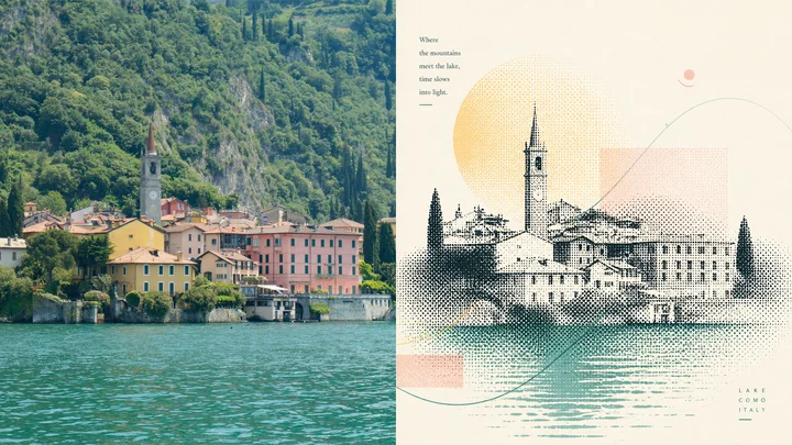
 en sample 05XXD Panel 104 · Halftone Zen Journal
prompt library
成员提示词库
-
套提示词风格
- 全量解锁提示词、参数与案例
- 持续上新新提示词与实用场景
- 作者答疑使用问题直接沟通
正在确认当前可用的年度方案…
zhishixingqiu
知识星球
扫码加入星球,持续获取提示词更新、插件资料和项目答疑;星球会员也可以解锁成员提示词库。
 扫码或点击加入知识星球
认识小小东
添加微信,获取提示词、插件、Skills 与 AI 出图支持

扫描,添加小小东个人微信
built by xiaoxiaodong
我开发的项目
谷歌插件和 GitHub 项目分开展示
16 个可用项目chrome web store
谷歌插件
github
GitHub 项目
正在计算符合当前颜色的内容…
你已看完 10 页免费内容
开通 VIP,解锁完整提示词库。
开源 Skills
Skills
浏览小小东开源的 Codex / Agent Skills。按现有瀑布流节奏展开,找到合适的能力后即可复制安装命令。
正在加载 Skills…
没有找到匹配的 Skill。
Open prompts
XXD Panel 104
8 real examples in the XXD Panel 104 · Halftone Zen Journal style, with complete prompts available to copy without signing in.
Original style prompt
Please turn each photograph I upload into a separate, premium design poster. Do not combine multiple images; output each photograph individually. Use an overall 3:4 portrait composition divided into upper and lower regions of strictly equal height, each occupying 50% of the canvas.

Keep the original photograph in the upper half, preserving the subject's identity, structure, pose, authentic texture, natural light and shadow, and original colour atmosphere. Apply only subtle, refined colour grading to give it the visual quality of an art magazine, independent publication, or exhibition image. The surrounding environment may be extended naturally to fit the canvas, but the subject must not be stretched, distorted, or altered.

For the lower half, extract the photograph's **most memorable subject, silhouette, pose, and narrative relationships—the elements most worth preserving**. Do not reproduce the whole scene or turn it into a realistic illustration. Instead, reconstruct these essential visual cues as an **abstract artwork with the character of halftone printing**. Compress the subject into a small number of its most recognisable shapes, edges, silhouettes, or partial structures, then reorganise them with black or dark halftone dots, changing densities, halftone grain, and layered print textures. The original object should remain immediately perceptible, while also being clearly distilled, edited, and retold.

The lower half is not a collage of isolated elements; its core is a **strongly integrated overall composition**. Use halftone forms as the primary visual skeleton, then introduce a small number of coloured lines, paths, circled marks, guide lines, loops, or flowing graphics distilled from the source photograph's colours. Let lines and halftones, whitespace and colour blocks answer one another and form a complete, rhythmic image together. Every graphic intervention should serve emotion, direction, air, the sense of time, and internal order rather than becoming decorative accumulation.

The composition should value **artful whitespace, visual gravity, rhythms of density and openness, graphic relationships, and typographic order**. The subject may be centred or slightly offset, but the whole must remain balanced, restrained, and quiet. Retain large areas of pale background and breathing space so halftones, lines, and a few colour fields gain tension within the emptiness, creating a concise, understated visual character with meaningful pauses. The result should carry a touch of Zen: calm, perceptive, restrained, but never hollow.

Derive the palette by selecting and remixing the **brightest, freshest, and most vital colours** from the upper photograph rather than averaging its colours. Raise the overall luminosity and colour purity. Naturally inferred hues may include clear blue, aqua, tender green, warm yellow, coral orange, and peach pink; use fresh warm–cool relationships and a few accent colours to establish both a healing and an artistic quality. Keep the background ivory, warm white, or extremely pale. Avoid muddy grey, aged or sombre colour, low-key Morandi palettes, dark brown filters, neon colours, and a cheap candy-like look.

Introduce text sparingly. Distil a short title, phrase, or miniature annotation from the photograph's subject, emotion, action, sense of time, or symbolic meaning, and compose it together with the graphics. The text need not be neatly centred; it may follow the direction of a line, sit close to the halftone subject, or rest at the edge of the whitespace. Integrate it into the whole with restraint, precision, and lightness to create a natural editorial relationship between image and type.

Draw on the visual language of international design studios, art-exhibition posters, experimental editorial design, and printmaking. The final result should achieve a premium visual effect in which **halftone printing, coloured linear interventions, integrated composition, artful whitespace, and subtle Zen sensibility** work together. Avoid realistic illustration, meaningless decoration, accumulated elements, cheap filters, cartoon qualities, an overtly computer-generated appearance, and template-driven layouts.
en sample 05XXD Panel 104 · Halftone Zen Journal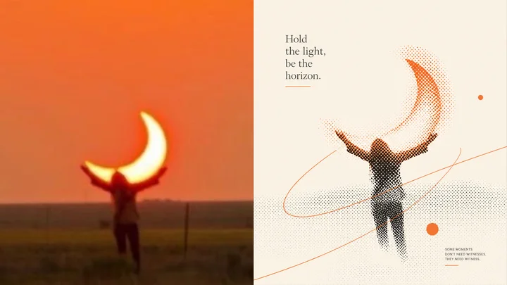 en sample 06XXD Panel 104 · Halftone Zen Journal
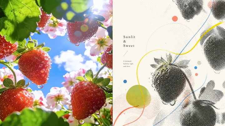 en sample 07XXD Panel 104 · Halftone Zen Journal
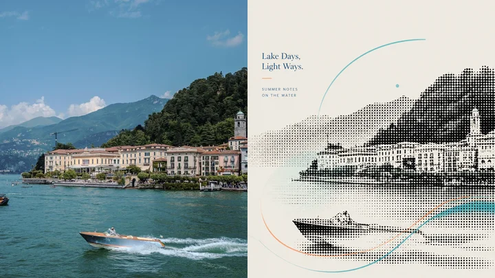 en sample 08XXD Panel 104 · Halftone Zen Journal
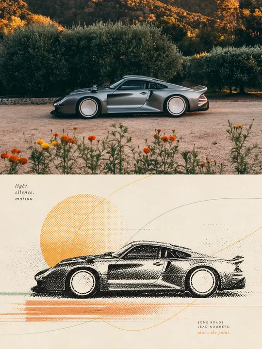 en sample 09XXD Panel 104 · Halftone Zen Journal
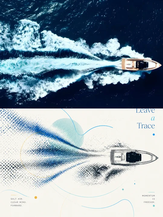 en sample 10XXD Panel 104 · Halftone Zen Journal
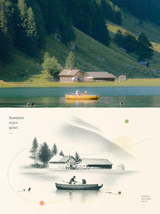 en sample 11XXD Panel 104 · Halftone Zen Journal
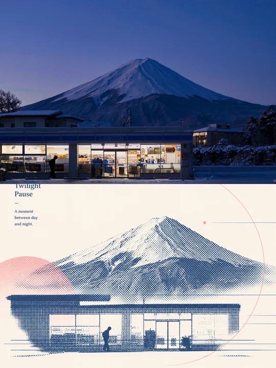 en sample 12XXD Panel 104 · Halftone Zen Journal
正在计算符合当前颜色的内容…
VIP 收录全部风格 每周持续新增,开源的只是其中一小部分。
还没有通知
有新通知时会出现在这里。
批量管理
正在建设中,预计一周后内上线。
已选 0 组
点击卡片选择或取消,删除后无法恢复