

Open prompts
en sample 02 AI Image Prompt
en sample 02, its complete AI image prompt, and the XXD Panel 031 · Allegorical Rubbing style are free to view and copy.
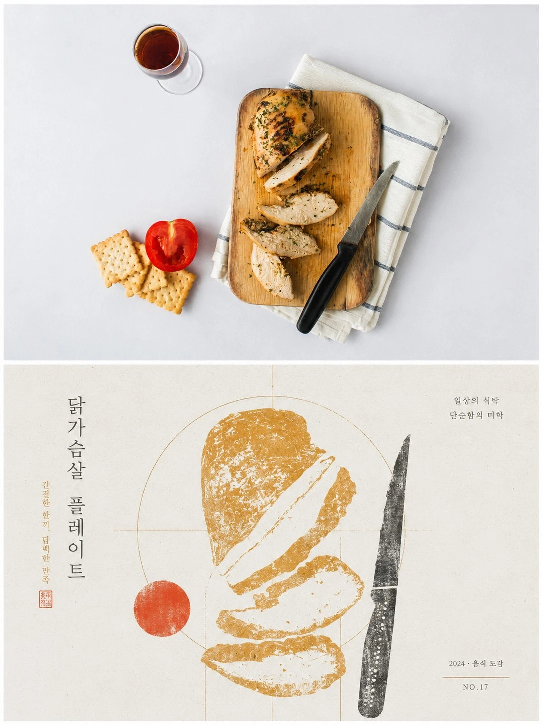
Complete AI image prompt
Please make every photo I upload into its own standalone high-end design poster; no multi-image collages, each photo output separately. The overall composition uses a 3:4 vertical format, with the upper and lower zones strictly 1:1 in height, each taking up 50% of the frame.

The upper half keeps the original photo, preserving the subject's structure, real texture, natural light and shadow, and original color atmosphere, applying only a slight high-end photographic color grade so that it carries the texture of art publications and exhibition photography. To fit the frame, the sky, ground, or environmental background may be extended naturally, but the subject must not be stretched, distorted, or altered.

The lower half extracts the most recognizable **subject, outline, pose, and narrative relationships** from the photo, first understands their core meaning, cultural attributes, or emotional relationships, and then reconstructs them into a graphic composition with the character of folk-art catalogs, antiquarian rubbings, and modern graphic design. Do not translate the elements in the photo one by one, and do not add generic traditional patterns; retain only **one core visual motif and a very small number of supporting forms that truly carry narrative meaning**. Through silhouette, negative shape, partial enlargement, form merging, and symbolic translation, make the graphics both correspond to the original object and express the meaning behind it.

The composition is built on a rigorous **geometric framework and proportional system**. Based on the subject's own structure, distill circles, squares, triangles, arcs, axes, or repeated proportions as the “geometric matrix,” then make all subjects, supporting graphics, text, and negative space relate to it through alignment, tangency, shared axes, nesting, mirroring, proportional progression, or boundary cropping. The layout may be freely distributed, eccentric, extend beyond boundaries, or asymmetrical, but it must share the same structural logic, forming a clear visual center of gravity, hierarchy, rhythm, and negative space; its order should be clear from afar, with traditional imprints and variations in detail becoming apparent only up close. Avoid random scattered points and decorative accumulation.

Extract from the upper photo the colors with the greatest recognizability, vitality, and spiritual character, and reorganize them into a fresh, restrained palette of paper-printing colors. Use a bright, pale paper ground to create breathing room, establish the visual framework with one dark color, then organize the subject and a small number of accents with 1–2 thematic colors derived from the original image. Build hierarchy through area proportions, overprinting, and value relationships. The colors should be clean and spirited; avoid dirty gray faux-aging, fixed folk color schemes, and cluttered multicolor palettes.

The material uses a hybrid texture of **woodcut rubbing, dry-brushed screen printing, and old-style catalog printing**. Broken ink, scuff marks, exposed ground, and uneven ink volume occur mainly inside the graphics, while geometric boundaries, important contours, and the overall layout remain clear and precise, creating a contrast of “rough materiality × rigorous geometric order.”

Text serves only as supporting information within the composition. Distill a small amount of titling and micro-annotations from the photo's theme, meaning, or cultural attributes. They may be freely arranged along geometric axes, negative shapes, or graphic boundaries, forming aligned, nested, or interwoven relationships with the subject, but must not seize the visual center.

The overall presentation has a visual character in which **meaning comes first, graphics are restrained, geometry is rigorous, rubbings are rough, negative space is clear, and a sense of traditional culture coexists with modern design order**. Every graphic that appears must have a source, a meaning, and a structural function; remove decorative elements that cannot enhance understanding of the theme, and avoid asset collage, arbitrary insertion of traditional symbols, evenly distributed layouts, realistic illustration, and a templated feel.
Original style prompt
Please make every photo I upload into its own standalone high-end design poster; no multi-image collages, each photo output separately. The overall composition uses a 3:4 vertical format, with the upper and lower zones strictly 1:1 in height, each taking up 50% of the frame.

The upper half keeps the original photo, preserving the subject's structure, real texture, natural light and shadow, and original color atmosphere, applying only a slight high-end photographic color grade so that it carries the texture of art publications and exhibition photography. To fit the frame, the sky, ground, or environmental background may be extended naturally, but the subject must not be stretched, distorted, or altered.

The lower half extracts the most recognizable **subject, outline, pose, and narrative relationships** from the photo, first understands their core meaning, cultural attributes, or emotional relationships, and then reconstructs them into a graphic composition with the character of folk-art catalogs, antiquarian rubbings, and modern graphic design. Do not translate the elements in the photo one by one, and do not add generic traditional patterns; retain only **one core visual motif and a very small number of supporting forms that truly carry narrative meaning**. Through silhouette, negative shape, partial enlargement, form merging, and symbolic translation, make the graphics both correspond to the original object and express the meaning behind it.

The composition is built on a rigorous **geometric framework and proportional system**. Based on the subject's own structure, distill circles, squares, triangles, arcs, axes, or repeated proportions as the “geometric matrix,” then make all subjects, supporting graphics, text, and negative space relate to it through alignment, tangency, shared axes, nesting, mirroring, proportional progression, or boundary cropping. The layout may be freely distributed, eccentric, extend beyond boundaries, or asymmetrical, but it must share the same structural logic, forming a clear visual center of gravity, hierarchy, rhythm, and negative space; its order should be clear from afar, with traditional imprints and variations in detail becoming apparent only up close. Avoid random scattered points and decorative accumulation.

Extract from the upper photo the colors with the greatest recognizability, vitality, and spiritual character, and reorganize them into a fresh, restrained palette of paper-printing colors. Use a bright, pale paper ground to create breathing room, establish the visual framework with one dark color, then organize the subject and a small number of accents with 1–2 thematic colors derived from the original image. Build hierarchy through area proportions, overprinting, and value relationships. The colors should be clean and spirited; avoid dirty gray faux-aging, fixed folk color schemes, and cluttered multicolor palettes.

The material uses a hybrid texture of **woodcut rubbing, dry-brushed screen printing, and old-style catalog printing**. Broken ink, scuff marks, exposed ground, and uneven ink volume occur mainly inside the graphics, while geometric boundaries, important contours, and the overall layout remain clear and precise, creating a contrast of “rough materiality × rigorous geometric order.”

Text serves only as supporting information within the composition. Distill a small amount of titling and micro-annotations from the photo's theme, meaning, or cultural attributes. They may be freely arranged along geometric axes, negative shapes, or graphic boundaries, forming aligned, nested, or interwoven relationships with the subject, but must not seize the visual center.

The overall presentation has a visual character in which **meaning comes first, graphics are restrained, geometry is rigorous, rubbings are rough, negative space is clear, and a sense of traditional culture coexists with modern design order**. Every graphic that appears must have a source, a meaning, and a structural function; remove decorative elements that cannot enhance understanding of the theme, and avoid asset collage, arbitrary insertion of traditional symbols, evenly distributed layouts, realistic illustration, and a templated feel.
More open images in the “XXD Panel 031 · Allegorical Rubbing” style