

Open prompts
en sample 09 AI Image Prompt
en sample 09, its complete AI image prompt, and the XXD Panel 100 · Folk-Craft Narrative Painting style are free to view and copy.
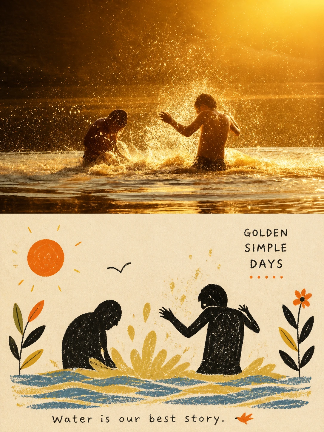
Complete AI image prompt
Create one independent premium design poster for each uploaded photograph, with no multi-photo collage. Use a 3:4 portrait composition with upper and lower regions of exactly equal height, each 50% of the canvas.

Preserve the original photograph above: subject identity, structure, pose, real texture, natural light and original colour atmosphere. Apply only subtle high-end grading for an art-magazine, independent-publication and exhibition-image quality. Extend the environment naturally if needed, but never stretch, distort or change the subject.

In the lower half extract the most recognisable **subject, silhouette, pose and narrative relationship**, rebuilding them as a **Naïve folk-inspired narrative illustration: a tactile flat narrative image with folk-art simplicity**. Do not fully depict the photograph. Remove detail deliberately and retell it with silhouettes, primitive forms, a few colour blocks and pictographic elements, keeping only clues that preserve identity and story so the source is immediately recognisable yet humble, humorous and full of everyday life.

Use **simplified silhouettes and large primitive forms**. People, animals, buildings, plants, objects and vehicles may be compressed, summarised and exaggerated without strict perspective or anatomy. Use flattened perspective, with height, overlap, scale and colour-block relationships carrying the narrative. Distribute supporting objects rhythmically as visual symbols, delete complex backgrounds, and let one key action, relationship or scene carry the story.

Use **the grain of crayon, oil pastel, coarse pencil and dry media**. Dark areas must retain rubbing, friction, layering, breaks and paper showing through rather than uniform fills. Keep hand-made error and awkwardness in the contours. Keep the image flat; avoid realistic lighting, metallic materials, complex volume and smooth digital vectors.

Reorganise **the photograph's most vivid, memorable colours** into a clear limited palette. Use warm-white paper and dark silhouettes as the base, then derive only a few blue, red, yellow, green, pink or orange spot accents from the source for clothing, plants, food, architecture or narrative focus. Keep colours bright but not oversaturated; avoid muddy, gloomy, Morandi, fluorescent and cheap candy colours.

Prioritise **narrative centre, visual weight, positive and negative shapes, scale rhythm and whitespace**. The subject may be offset, cropped or arranged in a loose triangle. Leave breathing room. Make the structure clear from afar and reveal hand-made grain and naïve wit up close.

Use very little text. Do not preset a title, place, number or language. Derive meaningful words from the subject, action, daily state, emotion or cultural context. Use **light folk-editorial lettering with slight hand-printing misregistration and irregular spacing**, optionally with handwriting, so words feel like a sign, menu, note or publication annotation integrated into the scene, never a neat commercial title bar.

The result combines **naïve silhouettes, flat space, crayon grain, limited colour, folk symbols and editorial narrative**: friendly, humorous, plain, intelligent and alive, with mature design judgement. Avoid children’s cartoons, cute stickers, realistic illustration, smooth vectors, complex perspective, detailed faces, excessive detail, 3D, e-commerce illustration and template effects.
Original style prompt
Create one independent premium design poster for each uploaded photograph, with no multi-photo collage. Use a 3:4 portrait composition with upper and lower regions of exactly equal height, each 50% of the canvas.

Preserve the original photograph above: subject identity, structure, pose, real texture, natural light and original colour atmosphere. Apply only subtle high-end grading for an art-magazine, independent-publication and exhibition-image quality. Extend the environment naturally if needed, but never stretch, distort or change the subject.

In the lower half extract the most recognisable **subject, silhouette, pose and narrative relationship**, rebuilding them as a **Naïve folk-inspired narrative illustration: a tactile flat narrative image with folk-art simplicity**. Do not fully depict the photograph. Remove detail deliberately and retell it with silhouettes, primitive forms, a few colour blocks and pictographic elements, keeping only clues that preserve identity and story so the source is immediately recognisable yet humble, humorous and full of everyday life.

Use **simplified silhouettes and large primitive forms**. People, animals, buildings, plants, objects and vehicles may be compressed, summarised and exaggerated without strict perspective or anatomy. Use flattened perspective, with height, overlap, scale and colour-block relationships carrying the narrative. Distribute supporting objects rhythmically as visual symbols, delete complex backgrounds, and let one key action, relationship or scene carry the story.

Use **the grain of crayon, oil pastel, coarse pencil and dry media**. Dark areas must retain rubbing, friction, layering, breaks and paper showing through rather than uniform fills. Keep hand-made error and awkwardness in the contours. Keep the image flat; avoid realistic lighting, metallic materials, complex volume and smooth digital vectors.

Reorganise **the photograph's most vivid, memorable colours** into a clear limited palette. Use warm-white paper and dark silhouettes as the base, then derive only a few blue, red, yellow, green, pink or orange spot accents from the source for clothing, plants, food, architecture or narrative focus. Keep colours bright but not oversaturated; avoid muddy, gloomy, Morandi, fluorescent and cheap candy colours.

Prioritise **narrative centre, visual weight, positive and negative shapes, scale rhythm and whitespace**. The subject may be offset, cropped or arranged in a loose triangle. Leave breathing room. Make the structure clear from afar and reveal hand-made grain and naïve wit up close.

Use very little text. Do not preset a title, place, number or language. Derive meaningful words from the subject, action, daily state, emotion or cultural context. Use **light folk-editorial lettering with slight hand-printing misregistration and irregular spacing**, optionally with handwriting, so words feel like a sign, menu, note or publication annotation integrated into the scene, never a neat commercial title bar.

The result combines **naïve silhouettes, flat space, crayon grain, limited colour, folk symbols and editorial narrative**: friendly, humorous, plain, intelligent and alive, with mature design judgement. Avoid children’s cartoons, cute stickers, realistic illustration, smooth vectors, complex perspective, detailed faces, excessive detail, 3D, e-commerce illustration and template effects.
More open images in the “XXD Panel 100 · Folk-Craft Narrative Painting” style