

Open prompts
en sample 11 AI Image Prompt
en sample 11, its complete AI image prompt, and the XXD Panel 025 · Invisible Imagery style are free to view and copy.
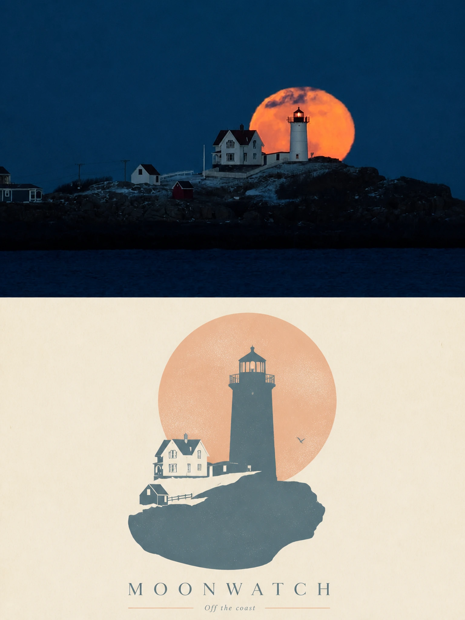
Complete AI image prompt
Please make every photo I upload into its own standalone high-end design poster; no multi-image collages, each photo output separately. The overall composition uses a 3:4 vertical format, with the upper and lower zones strictly 1:1 in height, each taking up 50% of the frame.

The upper half keeps the original photo, preserving the subject's structure, real texture, natural light and shadow, and original color atmosphere, applying only a slight high-end photographic color grade so that it has the texture of art magazines, independent publications, and exhibition photography. To fit the frame, the sky, ground, or environmental background may be extended naturally, but the subject must not be stretched, distorted, or altered.

The lower half extracts the most recognizable **subject, outline, pose, and narrative relationships** from the photo and reconstructs them as a minimalist Gestalt positive-negative form screen print. Preserve the subject's most distinctive outer contour while distilling from the original image an environment, structure, object, or symbolic image most closely related to it, allowing the two to merge into one complete graphic through **interlocking contours, negative-space cutouts, shared boundaries, and figure-ground reversal**: from a distance, the subject is recognized first; only up close is another scene or image discovered hidden within. Do not simply superimpose the two objects; instead, let the edge of one shape naturally become the boundary of the other.

Keep the composition to a **single visual anchor, clear silhouette, and large areas of negative space**. Determine its position according to the subject's own pose, orientation, center of gravity, and contour flow; an off-center placement, partial cropping, vertical nesting, or edge alignment may be used to create a clever visual transition between positive and negative forms. Supporting elements must be extremely few, so that the visual interest comes primarily from the instantaneous shift between “what is seen” and “what is seen again,” rather than from complex decoration.

Use a soothing, soft, and sophisticated **Morandi pastel system**, referencing the low-saturation color logic of dreamlike architectural spaces: mist pink, soft apricot, gray-green, sage, pale terracotta, cream yellow, mist blue, gray-purple, and similar shades coordinated with one another. Use a light paper surface as the base, selecting the most spirited color relationships from the original photo and softening and reorganizing them. Keep the overall palette to 2–4 colors, establishing layers through combined color temperature, differences in value, and proportions of area. Colors should be clean, soft, and airy; avoid muddy gray, heavy distressed aging, fluorescent colors, and high-contrast commercial color schemes.

Retain slight paper fibers, screen-printing grain, ink coverage, and registration offsets to give the graphic a genuine printmaking tactility, while keeping edges crisp and color blocks flat. Do not use gradients, 3D volume, realistic shadows, or a smooth CG texture.

Text also participates in the positive-negative form composition. Distill a short title from the photo's **identity, location, action, emotion, state, or symbolic meaning**, paired with a very small amount of location, numbering, state words, or micro-annotations. Text may be arranged along the subject's contour, the boundary of the negative form, a horizontal baseline, or the axis of the negative space; it may also be partially embedded in the graphic, interrupted by a contour, or occluded by a color block, making the text feel like part of the print structure rather than a title added afterward. Keep the overall treatment small, restrained, intelligent, and imbued with a sophisticated editorial feel.

The overall presentation combines the visual temperament of **minimalist geometry, Gestalt optical illusion, soft Morandi colors, screen printing, and poetic narrative**. Whether the subject is a person, animal, plant, building, object, vehicle, or natural landscape, it should maintain the dual reading experience of “recognize the subject at first glance, discover the hidden image at second glance,” avoiding multiple parallel focal points, direct collage, complex illustration, a cartoon feel, a commercial promotional feel, and a template feel.
Original style prompt
Please make every photo I upload into its own standalone high-end design poster; no multi-image collages, each photo output separately. The overall composition uses a 3:4 vertical format, with the upper and lower zones strictly 1:1 in height, each taking up 50% of the frame.

The upper half keeps the original photo, preserving the subject's structure, real texture, natural light and shadow, and original color atmosphere, applying only a slight high-end photographic color grade so that it has the texture of art magazines, independent publications, and exhibition photography. To fit the frame, the sky, ground, or environmental background may be extended naturally, but the subject must not be stretched, distorted, or altered.

The lower half extracts the most recognizable **subject, outline, pose, and narrative relationships** from the photo and reconstructs them as a minimalist Gestalt positive-negative form screen print. Preserve the subject's most distinctive outer contour while distilling from the original image an environment, structure, object, or symbolic image most closely related to it, allowing the two to merge into one complete graphic through **interlocking contours, negative-space cutouts, shared boundaries, and figure-ground reversal**: from a distance, the subject is recognized first; only up close is another scene or image discovered hidden within. Do not simply superimpose the two objects; instead, let the edge of one shape naturally become the boundary of the other.

Keep the composition to a **single visual anchor, clear silhouette, and large areas of negative space**. Determine its position according to the subject's own pose, orientation, center of gravity, and contour flow; an off-center placement, partial cropping, vertical nesting, or edge alignment may be used to create a clever visual transition between positive and negative forms. Supporting elements must be extremely few, so that the visual interest comes primarily from the instantaneous shift between “what is seen” and “what is seen again,” rather than from complex decoration.

Use a soothing, soft, and sophisticated **Morandi pastel system**, referencing the low-saturation color logic of dreamlike architectural spaces: mist pink, soft apricot, gray-green, sage, pale terracotta, cream yellow, mist blue, gray-purple, and similar shades coordinated with one another. Use a light paper surface as the base, selecting the most spirited color relationships from the original photo and softening and reorganizing them. Keep the overall palette to 2–4 colors, establishing layers through combined color temperature, differences in value, and proportions of area. Colors should be clean, soft, and airy; avoid muddy gray, heavy distressed aging, fluorescent colors, and high-contrast commercial color schemes.

Retain slight paper fibers, screen-printing grain, ink coverage, and registration offsets to give the graphic a genuine printmaking tactility, while keeping edges crisp and color blocks flat. Do not use gradients, 3D volume, realistic shadows, or a smooth CG texture.

Text also participates in the positive-negative form composition. Distill a short title from the photo's **identity, location, action, emotion, state, or symbolic meaning**, paired with a very small amount of location, numbering, state words, or micro-annotations. Text may be arranged along the subject's contour, the boundary of the negative form, a horizontal baseline, or the axis of the negative space; it may also be partially embedded in the graphic, interrupted by a contour, or occluded by a color block, making the text feel like part of the print structure rather than a title added afterward. Keep the overall treatment small, restrained, intelligent, and imbued with a sophisticated editorial feel.

The overall presentation combines the visual temperament of **minimalist geometry, Gestalt optical illusion, soft Morandi colors, screen printing, and poetic narrative**. Whether the subject is a person, animal, plant, building, object, vehicle, or natural landscape, it should maintain the dual reading experience of “recognize the subject at first glance, discover the hidden image at second glance,” avoiding multiple parallel focal points, direct collage, complex illustration, a cartoon feel, a commercial promotional feel, and a template feel.
More open images in the “XXD Panel 025 · Invisible Imagery” style