

Open prompts
en sample 12 AI Image Prompt
en sample 12, its complete AI image prompt, and the XXD Panel 048 · Transparent Structure Journal style are free to view and copy.
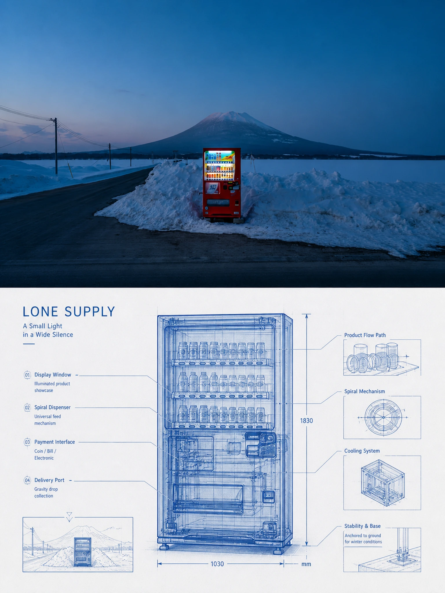
Complete AI image prompt
Please make every photo I upload into its own standalone high-end design poster; no multi-image collages, each photo output separately. The overall composition uses a 3:4 vertical format, with the upper and lower zones strictly 1:1 in height, each taking up 50% of the frame.

The upper half keeps the original photo, preserving the subject's structure, real texture, natural light and shadow, and original color atmosphere, applying only a slight high-end photographic color grade so that it carries the texture of art magazines, independent publications, and exhibition photography. To fit the frame, the sky, ground, or environmental background may be extended naturally, but the subject must not be stretched, distorted, or altered.

The lower half extracts the most recognizable subject, outline, pose, and narrative relationships from the photo and reconstructs them as a transparent structural blueprint and high-end technical diagram. Retain the subject's clearly recognizable external outline while transforming parts of its surface into semi-transparent, sectioned, layered, or see-through states, revealing its most representative internal structure, connection relationships, material layers, paths of movement, or spatial logic, and forming a visual language somewhere between engineering drawings, X-ray views, scientific diagrams, and futuristic archives. Do not mechanically pile up components; instead, determine how the "internal structure" is interpreted according to the subject's own properties: for objects, show components and connections; for buildings, space and construction; for vehicles, power and structure; for plants, veins and growth; and for animals or people, use pose skeletons, motion trajectories, clothing layers, or abstract structures, avoiding anatomical flesh and tissue.

The composition takes the subject as its sole core and establishes visual order through transparent overlays, localized enlargements, sectional slices, exploded views, structural leader lines, and fine annotations. Extremely thin axes, dimension lines, node numbers, local callout boxes, and small structural schematics may be added so that information unfolds naturally around the subject. Distinguish different levels through line weight, transparency, solid and dashed treatment, and density, maintaining large areas of clean negative space and a clear reading path while avoiding complex technological UI and full-page information clutter.

The color scheme extracts the most recognizable main color that best embodies the subject's spirit from the photo above, transforming it into a translucent, bright, business-oriented monochrome blueprint system, completed with a light background, one primary line color, and a small number of light-and-dark variations. It may use a clear blue, green, red, orange, purple, or neutral color system and is not fixed to blue. The color should be clean, rational, and luminous, with layers established through transparent overlays, line density, and localized highlights. Avoid dirty gray, darkness, neon cyber aesthetics, and complex multicolor schemes.

Text becomes part of the technical annotations and editorial layout. Distill a short title from the subject's identity, function, state, action, or symbolic meaning in the photo, and pair it with a small number of structural numbers, component names, state words, scale markings, directional notes, or micro-annotations. Through leader lines, rulers, arrows, local callout boxes, vertical setting, or edge typography, the text forms a precise relationship with the subject, like an explanatory system in an engineering sketch, while maintaining high-end magazine-style restraint and negative space. Do not use years or write long explanatory passages.

The overall result presents a high-end visual quality combining transparent structure, precise linework, layered revelation, engineering order, and editorial aesthetics. Whether the subject is a person, animal, plant, building, object, vehicle, or natural object, it should be recognizable at a glance, structurally logical, informationally restrained, and clearly layered. Avoid ordinary line art, cheap sci-fi HUDs, excessive mechanization, complex component clutter, fixed blue, and a template feel.
Original style prompt
Please make every photo I upload into its own standalone high-end design poster; no multi-image collages, each photo output separately. The overall composition uses a 3:4 vertical format, with the upper and lower zones strictly 1:1 in height, each taking up 50% of the frame.

The upper half keeps the original photo, preserving the subject's structure, real texture, natural light and shadow, and original color atmosphere, applying only a slight high-end photographic color grade so that it carries the texture of art magazines, independent publications, and exhibition photography. To fit the frame, the sky, ground, or environmental background may be extended naturally, but the subject must not be stretched, distorted, or altered.

The lower half extracts the most recognizable subject, outline, pose, and narrative relationships from the photo and reconstructs them as a transparent structural blueprint and high-end technical diagram. Retain the subject's clearly recognizable external outline while transforming parts of its surface into semi-transparent, sectioned, layered, or see-through states, revealing its most representative internal structure, connection relationships, material layers, paths of movement, or spatial logic, and forming a visual language somewhere between engineering drawings, X-ray views, scientific diagrams, and futuristic archives. Do not mechanically pile up components; instead, determine how the "internal structure" is interpreted according to the subject's own properties: for objects, show components and connections; for buildings, space and construction; for vehicles, power and structure; for plants, veins and growth; and for animals or people, use pose skeletons, motion trajectories, clothing layers, or abstract structures, avoiding anatomical flesh and tissue.

The composition takes the subject as its sole core and establishes visual order through transparent overlays, localized enlargements, sectional slices, exploded views, structural leader lines, and fine annotations. Extremely thin axes, dimension lines, node numbers, local callout boxes, and small structural schematics may be added so that information unfolds naturally around the subject. Distinguish different levels through line weight, transparency, solid and dashed treatment, and density, maintaining large areas of clean negative space and a clear reading path while avoiding complex technological UI and full-page information clutter.

The color scheme extracts the most recognizable main color that best embodies the subject's spirit from the photo above, transforming it into a translucent, bright, business-oriented monochrome blueprint system, completed with a light background, one primary line color, and a small number of light-and-dark variations. It may use a clear blue, green, red, orange, purple, or neutral color system and is not fixed to blue. The color should be clean, rational, and luminous, with layers established through transparent overlays, line density, and localized highlights. Avoid dirty gray, darkness, neon cyber aesthetics, and complex multicolor schemes.

Text becomes part of the technical annotations and editorial layout. Distill a short title from the subject's identity, function, state, action, or symbolic meaning in the photo, and pair it with a small number of structural numbers, component names, state words, scale markings, directional notes, or micro-annotations. Through leader lines, rulers, arrows, local callout boxes, vertical setting, or edge typography, the text forms a precise relationship with the subject, like an explanatory system in an engineering sketch, while maintaining high-end magazine-style restraint and negative space. Do not use years or write long explanatory passages.

The overall result presents a high-end visual quality combining transparent structure, precise linework, layered revelation, engineering order, and editorial aesthetics. Whether the subject is a person, animal, plant, building, object, vehicle, or natural object, it should be recognizable at a glance, structurally logical, informationally restrained, and clearly layered. Avoid ordinary line art, cheap sci-fi HUDs, excessive mechanization, complex component clutter, fixed blue, and a template feel.
More open images in the “XXD Panel 048 · Transparent Structure Journal” style