


Open prompts
sample 06 AI Image Prompt
sample 06, its complete AI image prompt, and the Typography & Posters · Line Art · Vector · 242 style are free to view and copy.
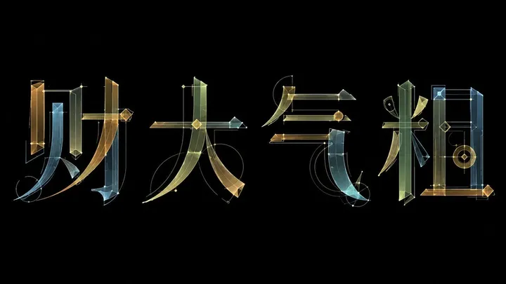
Complete AI image prompt
Make the theme lettering read first as a monumental glyph system being visibly engineered into existence. Preserve valid character order, orthographic topology, counters, and instant recognition in the chosen writing system, then rebuild the forms with extreme stroke contrast: weight-bearing stems and planes anchor the words while a few horizontals, diagonals, terminals, and counter edges extend into razor-thin leads, sweeping ribbon strokes, generous loops, and long arcs that cross neighboring glyphs before reconnecting to the structure. Let characters share anchors, overlap, mask one another, and continue across gaps so the eye follows one serpentine typographic current rather than separate font shapes. Organize the dominant letter mass on a firm baseline and an implied modular grid, surrounded by a broad quiet field; permit only selected swashes, tails, and loops to escape far beyond that order, their light reach counterbalancing the dense core in dynamic equilibrium. Translate the theme's meaning into curvature, aperture, center of gravity, modular substitutions, and symbolic nodes, with any attached marks derived from its own semantics. Build a recessed information tier from concise titles, indices, date-like codes, coordinate-style numbers, color keys, separators, and micro labels: tiny scale, wide tracking, sparse edge alignment, enough to establish precision and scale without competing with the main read. Expose the lettering process through hairline baselines, construction extensions, compass arcs, tangents, crosshair targets, diamond anchors, ticks, corner marks, and four-point calibration glints, each intermittently placed and genuinely aligned to glyph endpoints, joints, or changes of curvature. Allow selected strokes to reveal an inner assembly of translucent rectangular members, curved bands, tubular facets, doubled outlines, and calibrated joints, while the remaining major strokes stay flat, dense, and optically solid for distance recognition. Limit color to a field tone, one commanding theme-derived hue, and one or two small counter-colors. A warm pale matte field may carry crisp saturated ink for a bright editorial register, or a deep field may carry restrained cool-warm translucent members with instrument-like luminosity; in either mode, reserve peak brightness for intersections, bends, terminals, and star points, and let transparent overlaps create a controlled third hue. Keep the field even and quiet, edges crisp, fine lines continuous, and fills unbroken. The hierarchy must unfold in three beats—recognize the phrase, discover its construction, then read the peripheral data—combining the velocity of authored curves, the logic of modular drafting, and the lightness of disciplined empty space.
More open images in the “Typography & Posters · Line Art · Vector · 242” style