


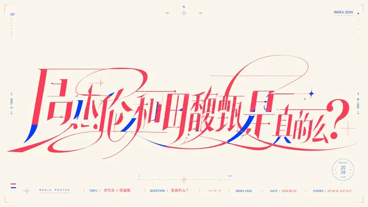
 sample 01Typography & Posters · Line Art · Vector · 242
Loading your library…
Loading your library…
The network is slow — still loading…
The network is slow — still loading…
prompt library
成员提示词库
海报、写真、PPT、电商、包装、插画、节日节气……每一张都附完整提示词 · 看全部作品
create
作图
挑一个场景,写一句话就能出图,挑中的风格直接带进去;小红书、PPT、漫画可以一次做一整套。
zhishixingqiu
知识星球
扫码加入星球,持续获取提示词更新、插件资料和项目答疑;星球会员也可以解锁成员提示词库。
 扫码或点击加入知识星球
认识小小东
添加微信,获取提示词、插件、Skills 与 AI 出图支持

扫描,添加小小东个人微信
built by xiaoxiaodong
我开发的项目
13 个谷歌插件 · 5 个 GitHub 项目,都在用
chrome web store
谷歌插件
github
GitHub 项目
你已看完 10 页免费内容
开通年费会员,解锁完整提示词库,AI 使用问题一对一问作者。
正在加载 Skills…
没有找到匹配的 Skill。
Open prompts
Typography & Posters
10 real examples in the Typography & Posters · Line Art · Vector · 242 style, with complete prompts available to copy without signing in.
sample 01Typography & Posters · Line Art · Vector · 242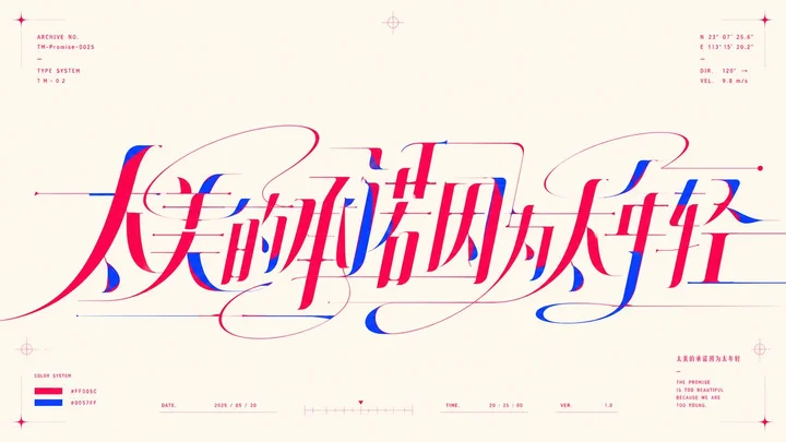 sample 02Typography & Posters · Line Art · Vector · 242
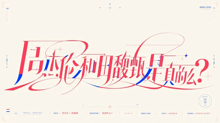 sample 01Typography & Posters · Line Art · Vector · 242
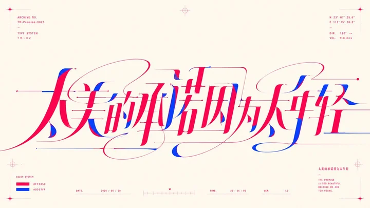 sample 02Typography & Posters · Line Art · Vector · 242
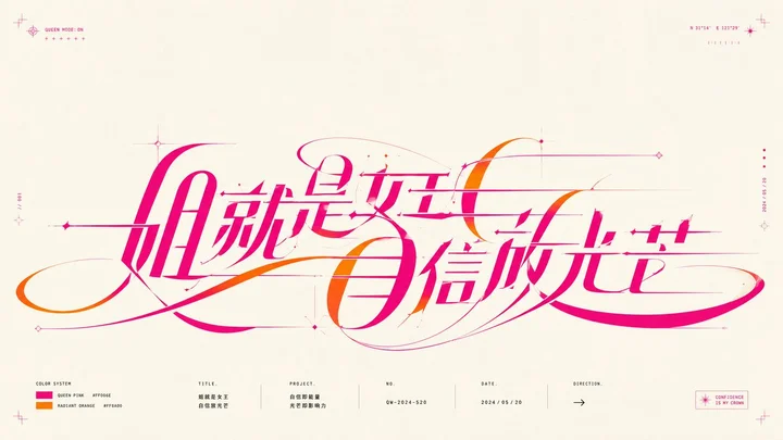 sample 03Typography & Posters · Line Art · Vector · 242
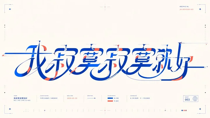 sample 04Typography & Posters · Line Art · Vector · 242
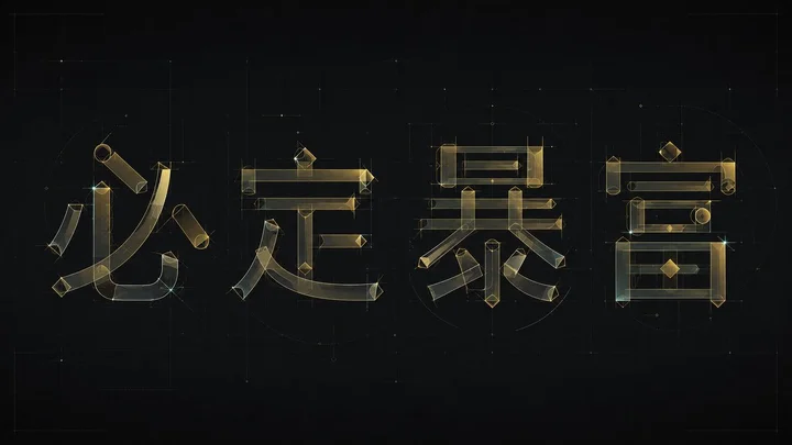 sample 05Typography & Posters · Line Art · Vector · 242
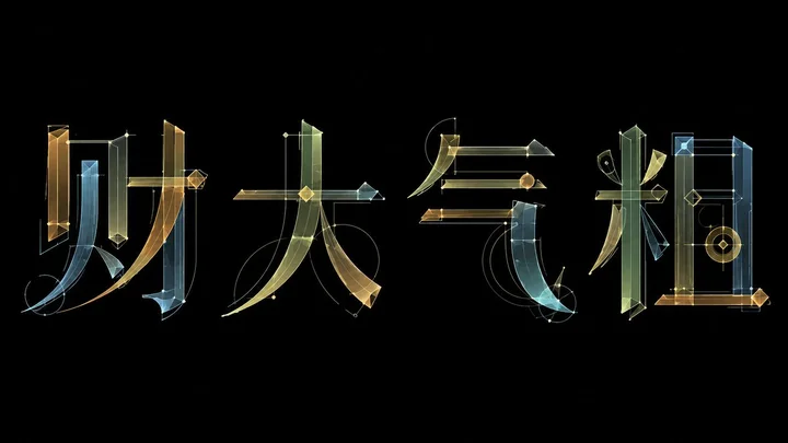 sample 06Typography & Posters · Line Art · Vector · 242
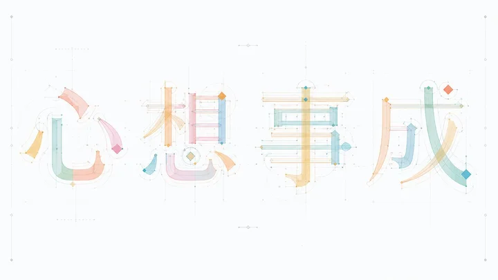 sample 07Typography & Posters · Line Art · Vector · 242
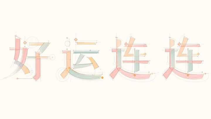 sample 08Typography & Posters · Line Art · Vector · 242
注册好了,先说清楚你能用什么
3 万多 套提示词风格,你现在全部能看
复制提示词、下载高清原图,要开通年费会员。
| 免费账号(现在) | 年费会员 | |
|---|---|---|
| 浏览全部作品 | 能看 | 能看 |
| 复制提示词 | 标「免费」的 | 全部 |
| 高清原图下载 | — | 可以 |
| 每周新增的风格 | 能看 | 能用 |
| 作者一对一 AI 咨询 | — | 可以 |
¥699 / 年¥1,398五折
支付后立即开通 · 有效期一年
免费账号:作品全部能看,标着「免费」的可以复制提示词。开通年费会员,全部提示词和高清原图都能用,还有作者一对一 AI 咨询。
Members library
你看到的,只是一小部分
会员库收录 套提示词风格,这里开放的只是精选样张,每周持续上新。
- 全量解锁每个风格的完整提示词、参数和全部案例
- 持续上新每周新增风格,跟上最新的模型和玩法
- 高清原图查看和下载原图,不再只是预览
- AI 咨询网络配置、工具安装、AI 用法,作者一对一
¥699 / 年¥1,398五折
支付后立即开通 · 有效期一年
VIP 收录全部风格 每周持续新增,开源的只是其中一小部分。
还没有通知
有新通知时会出现在这里。
正在建设中,预计一周后内上线。
已选 0 组
点击卡片选择或取消,删除后无法恢复
风格管理
正在加载上传工具…